1.2 Demonstration 2: Precision Agriculture
1.2.1 Project Overview
Objectives:
- Understand the impact of nitrogen on corn yield
- Understand how electric conductivity (EC) affects the marginal impact of nitrogen on corn
Datasets:
- The experimental design of an on-farm randomized nitrogen trail on an 80-acre field
- Data generated by the experiment
- As-applied nitrogen rate
- Yield measures
- Electric conductivity
Econometric Model:
Here is the econometric model, we would like to estimate:
\[ yield_i = \beta_0 + \beta_1 N_i + \beta_2 N_i^2 + \beta_3 N_i \cdot EC_i + \beta_4 N_i^2 \cdot EC_i + v_i \]
where \(yield_i\), \(N_i\), \(EC_i\), and \(v_i\) are corn yield, nitrogen rate, EC, and error term at subplot \(i\). Subplots which are obtained by dividing experimental plots into six of equal-area compartments.
GIS tasks
- read spatial data in various formats: R data set (rds), shape file, and GeoPackage file
- use
sf::st_read()
- use
- create maps using the
ggplot2package- use
ggplot2::geom_sf()
- use
- create subplots within experimental plots
- user-defined function that makes use of
st_geometry()
- user-defined function that makes use of
- identify corn yield, as-applied nitrogen, and electric conductivity (EC) data points within each of the experimental plots and find their averages
- use
sf::st_join()andsf::aggregate()
- use
Preparation for replication
- Run the following code to install or load (if already installed) the
pacmanpackage, and then install or load (if already installed) the listed package inside thepacman::p_load()function.
if (!require("pacman")) install.packages("pacman")
pacman::p_load(
  sf, # vector data operations
  dplyr, # data wrangling
  ggplot2, # for map creation
  modelsummary, # regression table generation
  patchwork # arrange multiple plots
)- Run the following code to define the theme for map:
theme_for_map <-
  theme(
    axis.ticks = element_blank(),
    axis.text = element_blank(),
    axis.line = element_blank(),
    panel.border = element_blank(),
    panel.grid = element_line(color = "transparent"),
    panel.background = element_blank(),
    plot.background = element_rect(fill = "transparent", color = "transparent")
  )
1.2.2 Project Demonstration
We have already run a whole-field randomized nitrogen experiment on a 80-acre field. Let’s import the trial design data
#--- read the trial design data ---#
trial_design_16 <- readRDS("Data/trial_design.rds")
Figure 1.4 is the map of the trial design generated using ggplot2 package.
#--- map of trial design ---#
ggplot(data = trial_design_16) +
  geom_sf(aes(fill = factor(NRATE))) +
  scale_fill_brewer(name = "N", palette = "OrRd", direction = 1) +
  theme_for_map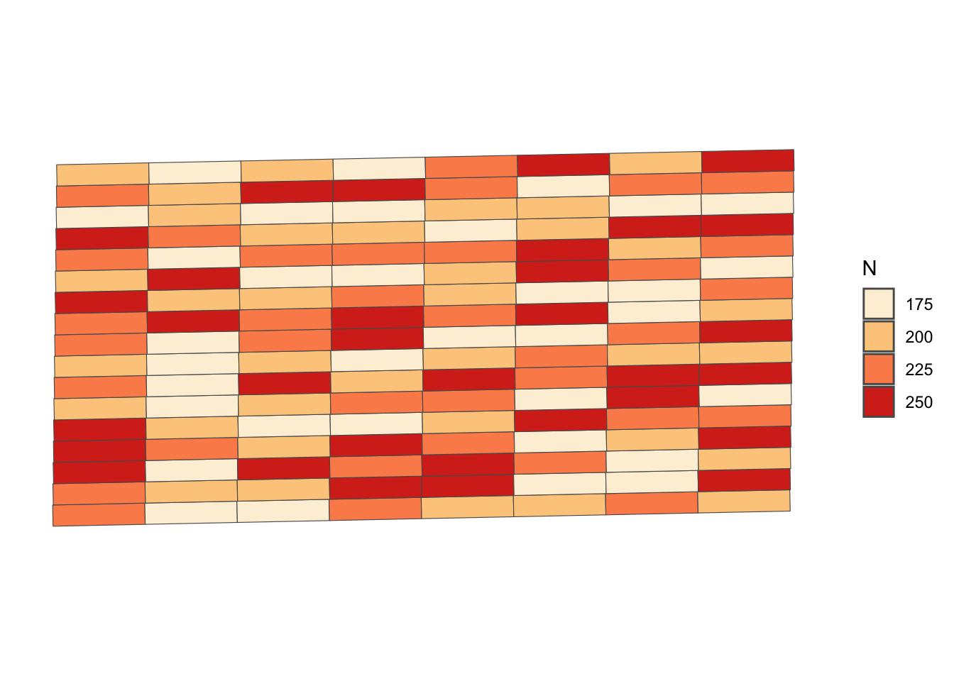
Figure 1.4: The Experimental Design of the Randomize Nitrogen Trial
We have collected yield, as-applied NH3, and EC data. Let’s read in these datasets:14
#--- read yield data (sf data saved as rds) ---#
yield <- readRDS("Data/yield.rds")

#--- read NH3 data (GeoPackage data) ---#
NH3_data <- st_read("Data/NH3.gpkg")

#--- read ec data (shape file) ---#
ec <- st_read(dsn = "Data", "ec")
Figure 1.5 shows the spatial distribution of the three variables. A map of each variable was made first, and then they are combined into one figure using the patchwork package15.
#--- yield map ---#
g_yield <-
  ggplot() +
  geom_sf(data = trial_design_16) +
  geom_sf(data = yield, aes(color = yield), size = 0.5) +
  scale_color_distiller(name = "Yield", palette = "OrRd", direction = 1) +
  theme_for_map

#--- NH3 map ---#
g_NH3 <-
  ggplot() +
  geom_sf(data = trial_design_16) +
  geom_sf(data = NH3_data, aes(color = aa_NH3), size = 0.5) +
  scale_color_distiller(name = "NH3", palette = "OrRd", direction = 1) +
  theme_for_map

#--- NH3 map ---#
g_ec <-
  ggplot() +
  geom_sf(data = trial_design_16) +
  geom_sf(data = ec, aes(color = ec), size = 0.5) +
  scale_color_distiller(name = "EC", palette = "OrRd", direction = 1) +
  theme_for_map

#--- stack the figures vertically and display (enabled by the patchwork package) ---#
g_yield / g_NH3 / g_ec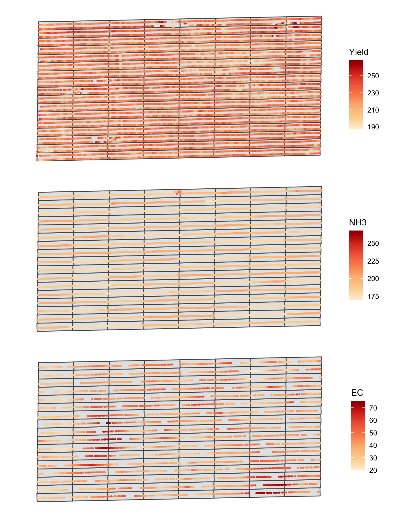
Figure 1.5: Spatial distribution of yield, NH3, and EC
Instead of using plot as the observation unit, we would like to create subplots inside each of the plots and make them the unit of analysis because it would avoid masking the within-plot spatial heterogeneity of EC. Here, we divide each plot into six subplots.
The following function generate subplots by supplying a trial design and the number of subplots you would like to create within each plot:
gen_subplots <- function(plot, num_sub) {

  #--- extract geometry information ---#
  geom_mat <- st_geometry(plot)[[1]][[1]]

  #--- upper left ---#
  top_start <- (geom_mat[2, ])

  #--- upper right ---#
  top_end <- (geom_mat[3, ])

  #--- lower right ---#
  bot_start <- (geom_mat[1, ])

  #--- lower left ---#
  bot_end <- (geom_mat[4, ])

  top_step_vec <- (top_end - top_start) / num_sub
  bot_step_vec <- (bot_end - bot_start) / num_sub

  # create a list for the sub-grid

  subplots_ls <- list()

  for (j in 1:num_sub) {
    rec_pt1 <- top_start + (j - 1) * top_step_vec
    rec_pt2 <- top_start + j * top_step_vec
    rec_pt3 <- bot_start + j * bot_step_vec
    rec_pt4 <- bot_start + (j - 1) * bot_step_vec

    rec_j <- rbind(rec_pt1, rec_pt2, rec_pt3, rec_pt4, rec_pt1)

    temp_quater_sf <- list(st_polygon(list(rec_j))) %>%
      st_sfc(.) %>%
      st_sf(., crs = 26914)

    subplots_ls[[j]] <- temp_quater_sf
  }

  return(do.call("rbind", subplots_ls))
}
Let’s run the function to create six subplots within each of the experimental plots.
#--- generate subplots ---#
subplots <-
  lapply(
    1:nrow(trial_design_16),
    function(x) gen_subplots(trial_design_16[x, ], 6)
  ) %>%
  do.call("rbind", .)
Figure 1.6 is a map of the subplots generated.
#--- here is what subplots look like ---#
ggplot(subplots) +
  geom_sf() +
  theme_for_map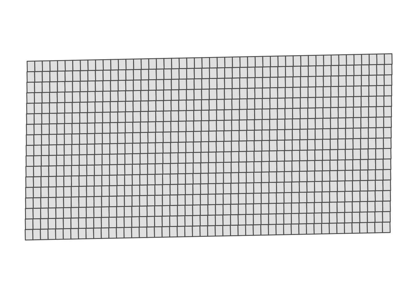
Figure 1.6: Map of the subplots
We now identify the mean value of corn yield, nitrogen rate, and EC for each of the subplots using sf::aggregate() and sf::st_join().
(
  reg_data <- subplots %>%
    #--- yield ---#
    st_join(., aggregate(yield, ., mean), join = st_equals) %>%
    #--- nitrogen ---#
    st_join(., aggregate(NH3_data, ., mean), join = st_equals) %>%
    #--- EC ---#
    st_join(., aggregate(ec, ., mean), join = st_equals)
)
Simple feature collection with 816 features and 3 fields
Geometry type: POLYGON
Dimension: XY
Bounding box: xmin: 560121.3 ymin: 4533410 xmax: 560758.9 ymax: 4533734
Projected CRS: NAD83 / UTM zone 14N
First 10 features:
yield aa_NH3 ec geometry
1 220.1789 194.5155 28.33750 POLYGON ((560121.3 4533428,...
2 218.9671 194.4291 29.37667 POLYGON ((560134.5 4533428,...
3 220.3286 195.2903 30.73600 POLYGON ((560147.7 4533428,...
4 215.3121 196.7649 32.24000 POLYGON ((560160.9 4533429,...
5 216.9709 195.2199 36.27000 POLYGON ((560174.1 4533429,...
6 227.8761 184.6362 31.21000 POLYGON ((560187.3 4533429,...
7 226.0991 179.2143 31.99250 POLYGON ((560200.5 4533430,...
8 225.3973 179.0916 31.56500 POLYGON ((560213.7 4533430,...
9 221.1820 178.9585 33.01000 POLYGON ((560227 4533430, 5...
10 219.4659 179.0057 41.89750 POLYGON ((560240.2 4533430,...Here are the visualization of the subplot-level data (Figure 1.7):
(ggplot() +
  geom_sf(data = reg_data, aes(fill = yield), color = NA) +
  scale_fill_distiller(name = "Yield", palette = "OrRd", direction = 1) +
  theme_for_map) /
  (ggplot() +
    geom_sf(data = reg_data, aes(fill = aa_NH3), color = NA) +
    scale_fill_distiller(name = "NH3", palette = "OrRd", direction = 1) +
    theme_for_map) /
  (ggplot() +
    geom_sf(data = reg_data, aes(fill = ec), color = NA) +
    scale_fill_distiller(name = "EC", palette = "OrRd", direction = 1) +
    theme_for_map)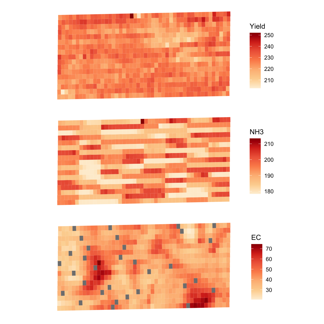
Figure 1.7: Spatial distribution of subplot-level yield, NH3, and EC
Let’s estimate the model and see the results:
ols_res <- lm(yield ~ aa_NH3 + I(aa_NH3^2) + I(aa_NH3 * ec) + I(aa_NH3^2 * ec), data = reg_data)

modelsummary(
  ols_res,
  stars = TRUE,
  gof_omit = "IC|Log|Adj|Within|Pseudo"
)| Model 1 | |
|---|---|
| (Intercept) | 327.993** |
| (125.638) | |
| aa_NH3 | −1.223 |
| (1.308) | |
| I(aa_NH3^2) | 0.004 |
| (0.003) | |
| I(aa_NH3 * ec) | 0.002 |
| (0.003) | |
| I(aa_NH3^2 * ec) | 0.000 |
| (0.000) | |
| Num.Obs. | 784 |
| R2 | 0.010 |
| F | 2.023 |
| RMSE | 5.71 |
| + p < 0.1, * p < 0.05, ** p < 0.01, *** p < 0.001 |
Here we are demonstrating that R can read spatial data in different formats. R can read spatial data of many other formats. Here, we are reading a shapefile (.shp) and GeoPackage file (.gpkg).↩︎
Here is its github page. See the bottom of the page to find vignettes.↩︎