R as GIS: Creating maps from vector data
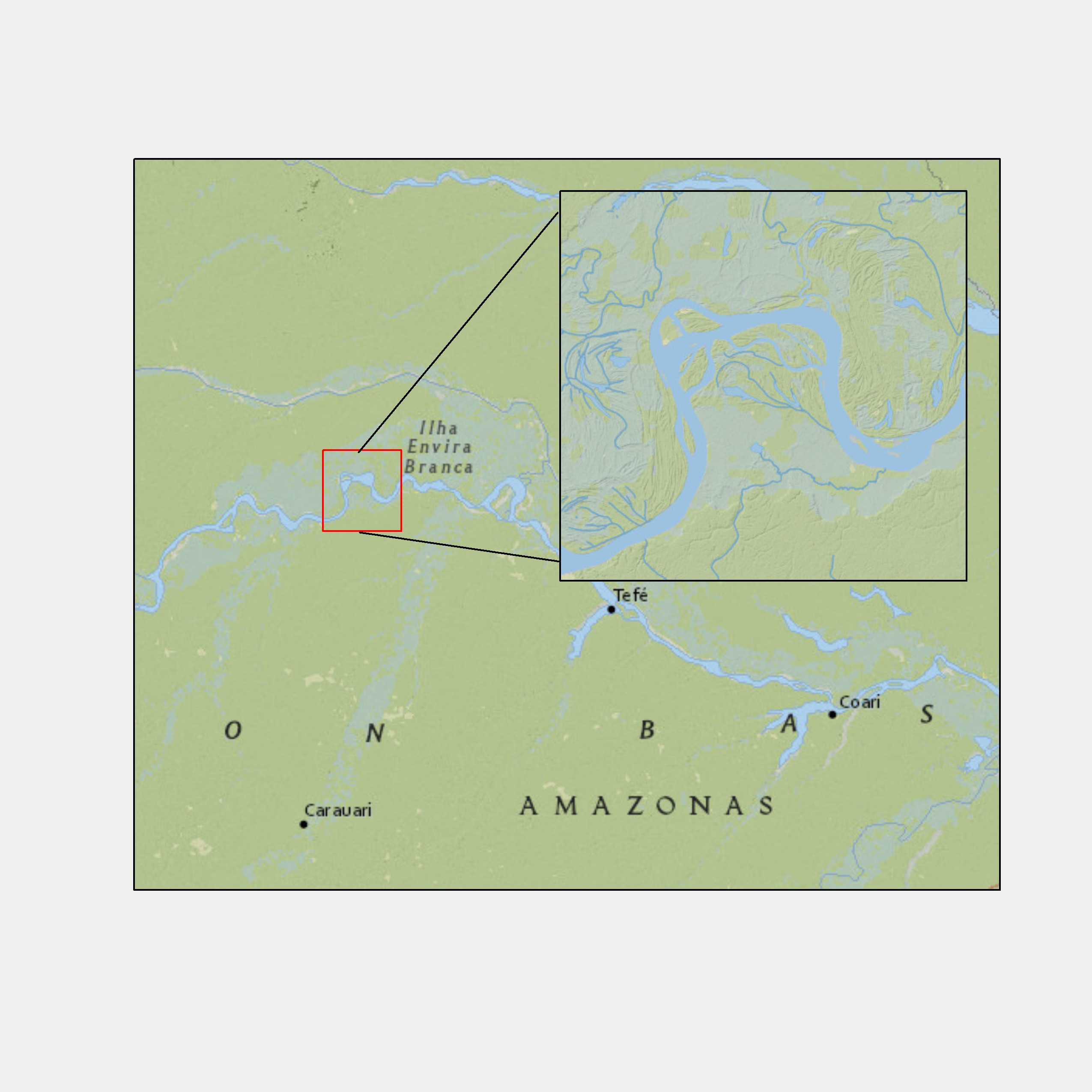
Inset map
Inset map (like one below) provides a better sense of the geographic extent and the location of the area of interest relative to the larger geographic extent that the readers are more familiar with.
Create a map like this using ne_counties with the ggmapinset package.
The first step of making an inset map is to create the base map layer, a part of which is going to be expanded as an inset.
We want to create a map of all the counties in Nebraska with only the three counties (Perkins, Chase, and Dundy) colored red.
Let’s first create an sf consisting of the three counties first:
We now create the base map. You use geom_sf() to create base map layers.
We now configure (specify) the inset using configure_inset(). Here is the list of parameters you want to provide:
centre: the geographic coordinates of the small circle from which you expandtranslation: how much you shift in x and y from the center to display the enlarged circleradius: radius of the small circle at the originscale: how much to enlargeunits: length unit
- Use
geom_sf_inset()and/orgeom_sf_text_inset()to create layers to present as an inset. - Use
geom_inset_frame()to add the inset frame (small circle, big circle, and the lines connecting them) - Use
coord_sf_inset(inset = inset_config)to reflect the configuration you set up earlier.
By default,
geom_sf_inset()creates two copies of the map layer: one for the base map and the other for the inset map.map_baseoption ingeom_sf_inset()determines whether you create the copy for the base map or not.
In the code below, map_base is not specified, meaning that geom_sf_inset(data = three_counties, fill = "black") will be applied for both the base and inset maps.