Ex-2-2: Fine tuning figures
1 Exercise 1
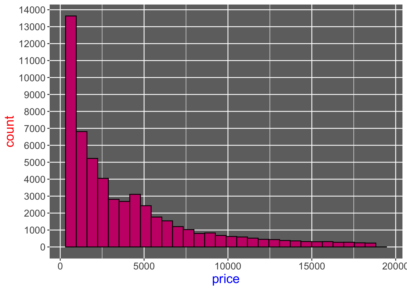
Using the diamonds data,
- Create a histogram for diamond prices (
price).- Set bin fill color to a color you like using its Hex code
- Set bin border color to a color you like using its Hex code
- Set
bins = 30
- Change the panel background color to
#6f6f6fusing the panel.background option insidetheme(). - Increase the x-axis and y-axis label text size to 12
- Change the y-axis breaks to
seq(0, 15000, by = 1000) - Change the color and size of x-axis title to “blue” and 16, respectively
- Change the color and size of y-axis title to “red” and 16, respectively
- Remove the minor grid lines of the y-axis
Here is the output you should be getting:
Code
ggplot(data = diamonds) +
  geom_histogram(
    aes(x = price),
    color = "#000000",
    fill = "#c90076",
    bins = 30
  ) +
  theme(
    axis.text = element_text(size = 12),
    axis.title.x = element_text(size = 16, color = "blue"),
    axis.title.y = element_text(size = 16, color = "red"),
    panel.grid.minor.y = element_blank(),
    panel.background = element_rect(fill = "#6f6f6f")
  ) +
  scale_y_continuous(breaks = seq(0, 15000, by = 1000))
2 Exercise 2
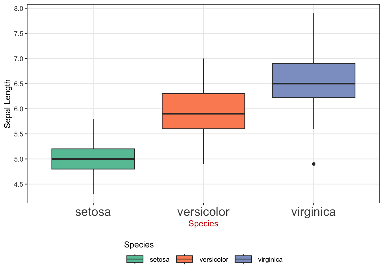
Using the iris data,
- Generate a boxplot of sepal lengths (
Sepal.Length) for each species (Species) - Apply one of the pre-made themes by the
ggthemespackage - Pick one palette from the list of “qualitative” palettes by the
RColorBrewerpackage (You can see the list by runningdisplay.brewer.all(type = "qual").) - Use the palette you picked in scale_A_B() to change the color scheme from the default
- A:
fillorcolor - B:
brewerordistiller
- A:
- Place the legend title at the top of the legend keys
- Change the y-axis title to “Sepal Length”
- Change the breaks of the y-axis to
seq(4, 8, by = 0.5) - Make the font size of x-axis text 12
- Change the color x-axis title to a color you like using the Hex code
- Place the legend at the bottom of the figure
- Change the width of the legend keys to 1cm.
- Remove the minor grid lines of the y-axis
Here is the output you should be getting:
Code
ggplot(data = iris) +
  geom_boxplot(aes(x = Species, y = Sepal.Length, fill = Species)) +
  theme_bw() +
  scale_fill_brewer(
    palette = "Set2",
    guide = guide_legend(title.position = "top")
  ) +
  ylab("Sepal Length") +
  theme(
    panel.grid.minor.y = element_blank(),
    axis.text.x = element_text(size = 16),
    axis.title.x = element_text(color = "#cc0000"),
    legend.position = "bottom",
    legend.key.width = unit(1, "cm")
  ) +
  scale_y_continuous(breaks = seq(4, 8, by = 0.5))
3 Exercise 3
Using the mpg data,
- Create a scatter plot of highway miles-per-gallon (
hwy) against engine displacement (displ).- Modify the point color based on drive type (
drv). - Set the size of the points to 3
- Modify the point color based on drive type (
- Use scale_
AviridisB() to apply the Viridis color scaleA:colororfillB:c(continuous) ord(discrete)
- Legend:
- Rename the legend title to “Drive Type”.
- Place the legend at the bottom of the figure
- Axis
- Change the y-axis and x-xis titles to “Miles per gallon” and “Displacement”, respectively
- Change the font size of y-axis and x-axis titles to 16
- Change the font size of y-axis and x-axis texts to 12
- Others:
- Make the background color of the panel to
#f3fbf5using thepanel.backgroundoption insidetheme().
- Make the background color of the panel to
Here is the output you should be getting:

Code
ggplot(data = mpg) +
  geom_point(aes(x = displ, y = hwy, shape = drv, color = class), size = 3) +
  scale_shape_manual(
    name = "Drive Type",
    values = c("f" = 16, "r" = 17, "4" = 18),
    labels = c("Front", "Rear", "Four-wheel")
  )
4 Exercise 4
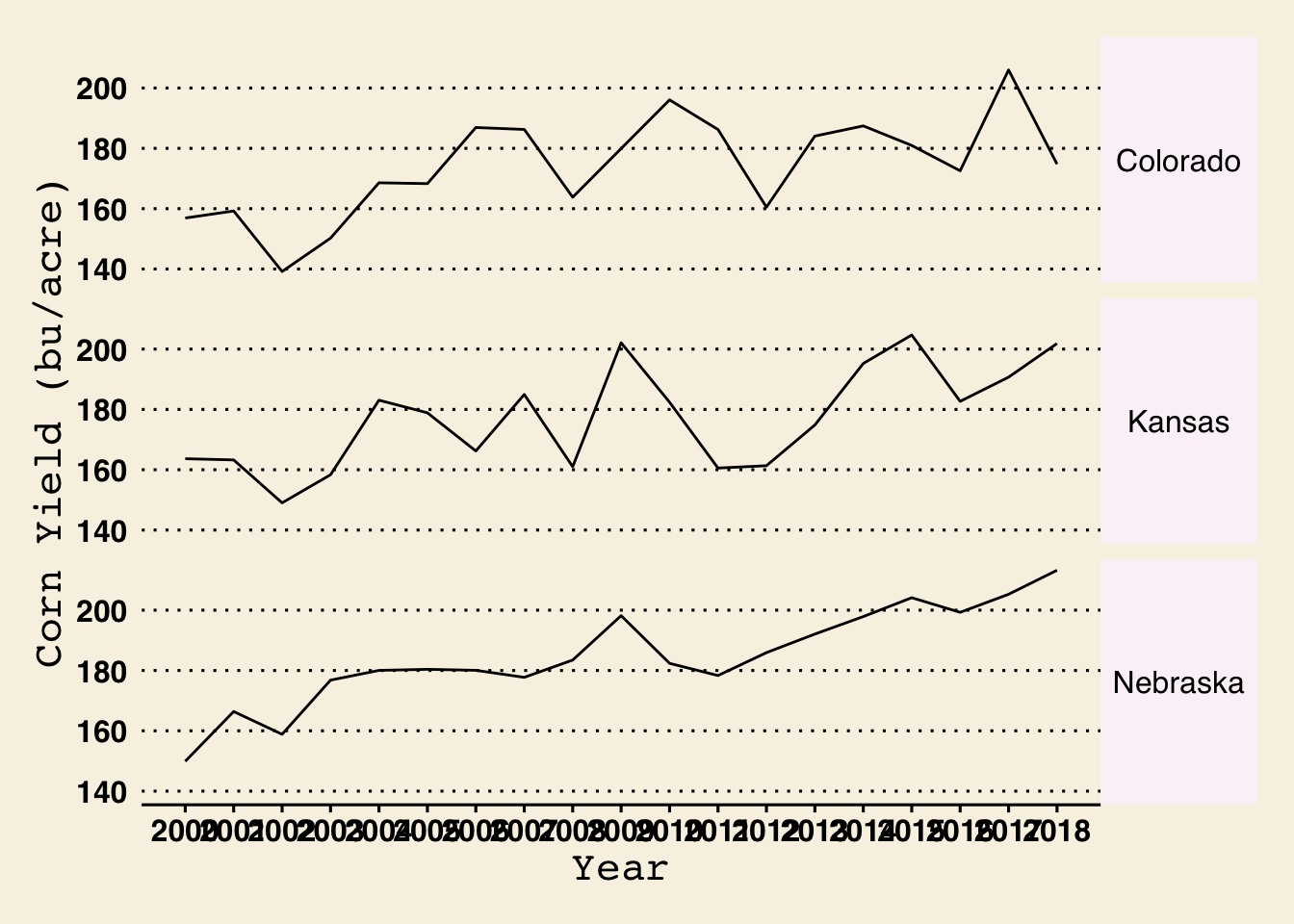
Using county_yield_y,
- Create a line plot of corn yield (
corn_yield) against year (year) faceted by State (state_name) - Apply
theme_wsj() - Axis
- Change the y-axis and x-axis titles to “Corn Yield (bu/acre)” and “Year”, respectively
- Change the breaks of x-axis to
2000:2018
- Theme
- Change the font size of x-axis and y-axis titles to 16
- Change the font size of x-axis and y-axis texts to 12
- Change the background color of the strips to #fbf3f9
- Change the background border color of the strips to blue
- Change the strip text size to 12 and set its angle to 0
Here is the output you should be getting:
Code
ggplot(data = county_yield_y) +
  geom_line(aes(x = year, y = corn_yield)) +
  facet_grid(state_name ~ .) +
  theme_wsj() +
  ylab("Corn Yield (bu/acre)") +
  xlab("Year") +
  scale_x_continuous(breaks = 2000:2018) +
  theme(
    axis.text = element_text(size = 12),
    axis.title = element_text(size = 16),
    strip.background = element_rect(fill = "#fbf3f9", color = "blue"),
    strip.text.y = element_text(size = 12, angle = 0)
  )