Ex-2-1: Data Visualization
1 Basics
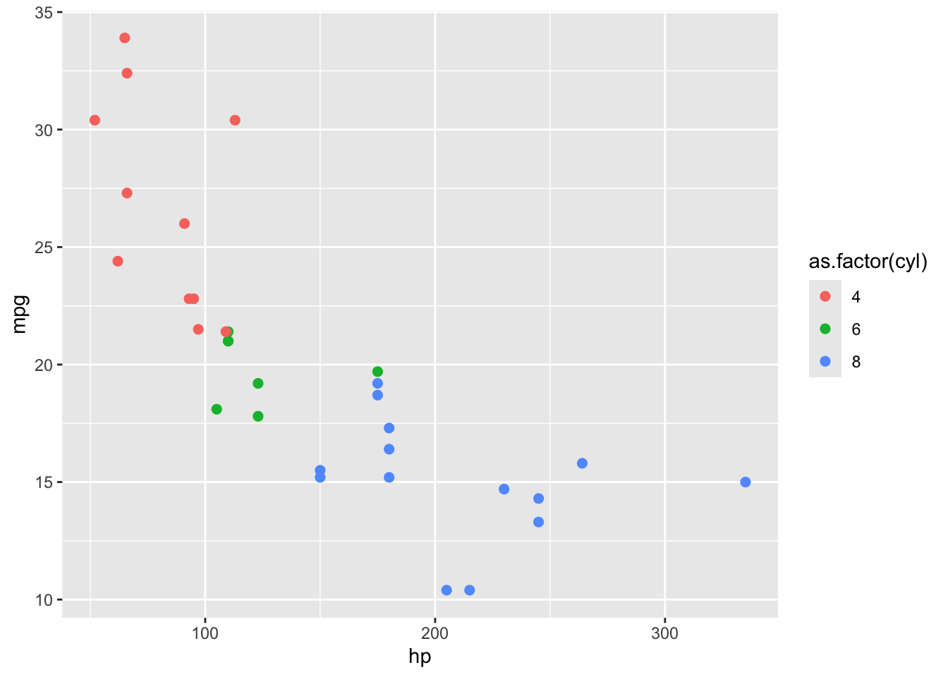
1.1 Exercise 1
Objective: Create a scatter plot of miles-per-gallon (mpg) against horsepower (hp), colored by the number of cylinders (cyl). Make the size of the points larger than the default (you can pick any value as long as it is larger than the default).
Here is the output you should be getting:
Code
ggplot(data = mtcars) +
  geom_point(aes(x = hp, y = mpg, color = as.factor(cyl)), size = 2)
1.2 Exercise 2
Objective: Create a boxplot showing the distribution of petal lengths (Petal.Length) for each species (Species). Make the color of the borders of the boxes red.
Here is the output you should be getting:
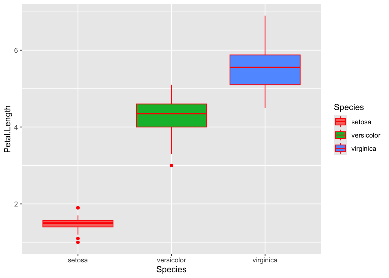
Code
ggplot(data = iris) +
  geom_boxplot(aes(x = Species, y = Petal.Length, fill = Species), color = "red")
1.3 Exercise 3
Objective: Create a histogram of diamond prices (price) by cut (the fill color of the histogram differs by cut). Use alpha = 0.6 so that the histograms are slightly transparent.
Here is the output you should be getting:
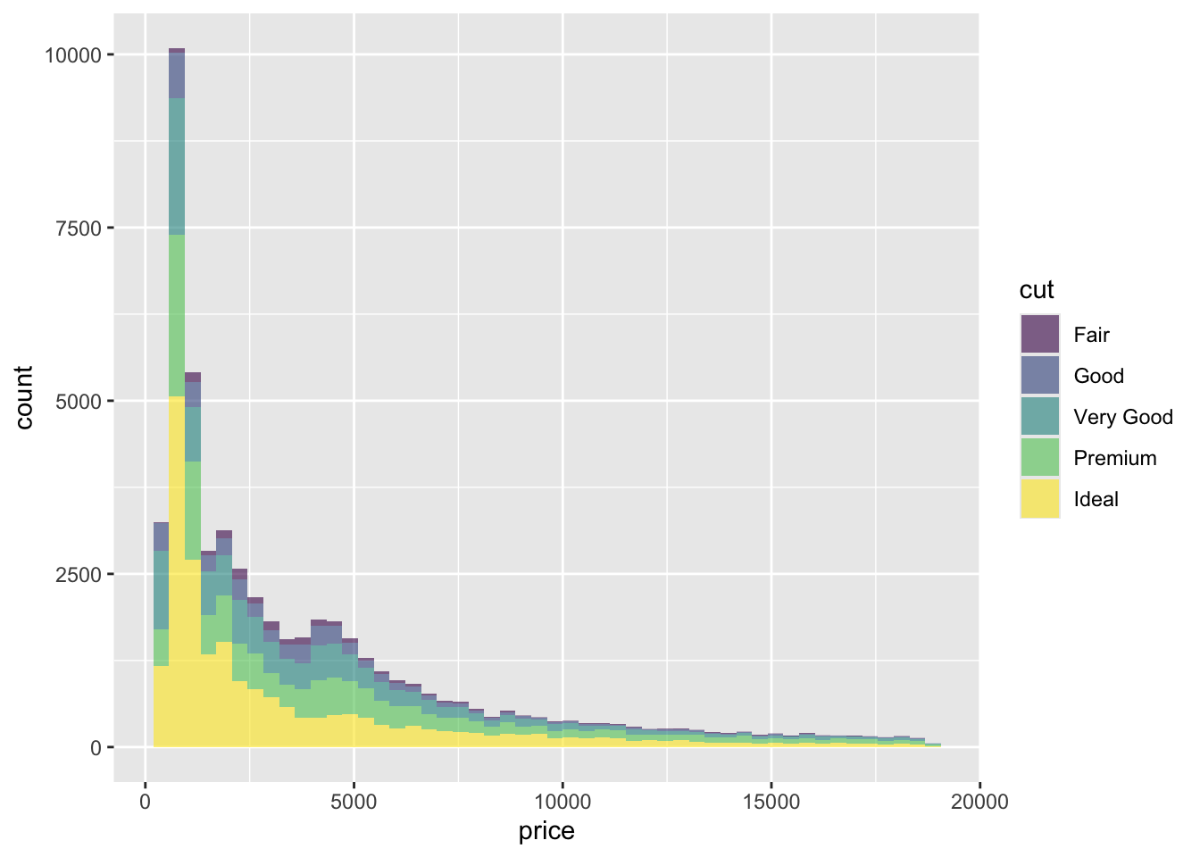
Code
ggplot(data = diamonds) +
  geom_histogram(
    aes(x = price, fill = cut),
    alpha = 0.6,
    bins = 50
  )
1.4 Exercise 4
Objective: Create a line plot that shows the progression of weight (weight) over time (Time) for each of the chicks that were fed Diet 1 (Hint: you first need to filter the data so that you only have the observations that has Diet == 1). Make the line color dependent on Chick.
Here is the output you should be getting:
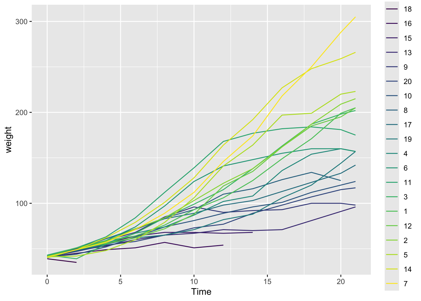
Code
ggplot(data = ChickWeight %>% filter(Diet == 1)) +
  geom_line(aes(x = Time, y = weight, color = Chick))
2 Faceted figures
2.1 Exercise 1
Objective: Create a scatter plot of miles-per-gallon (mpg) against weight (wt), colored by the number of gears (gear). Facet the plot by the number of cylinders (cyl).
Here is the output you should be getting:
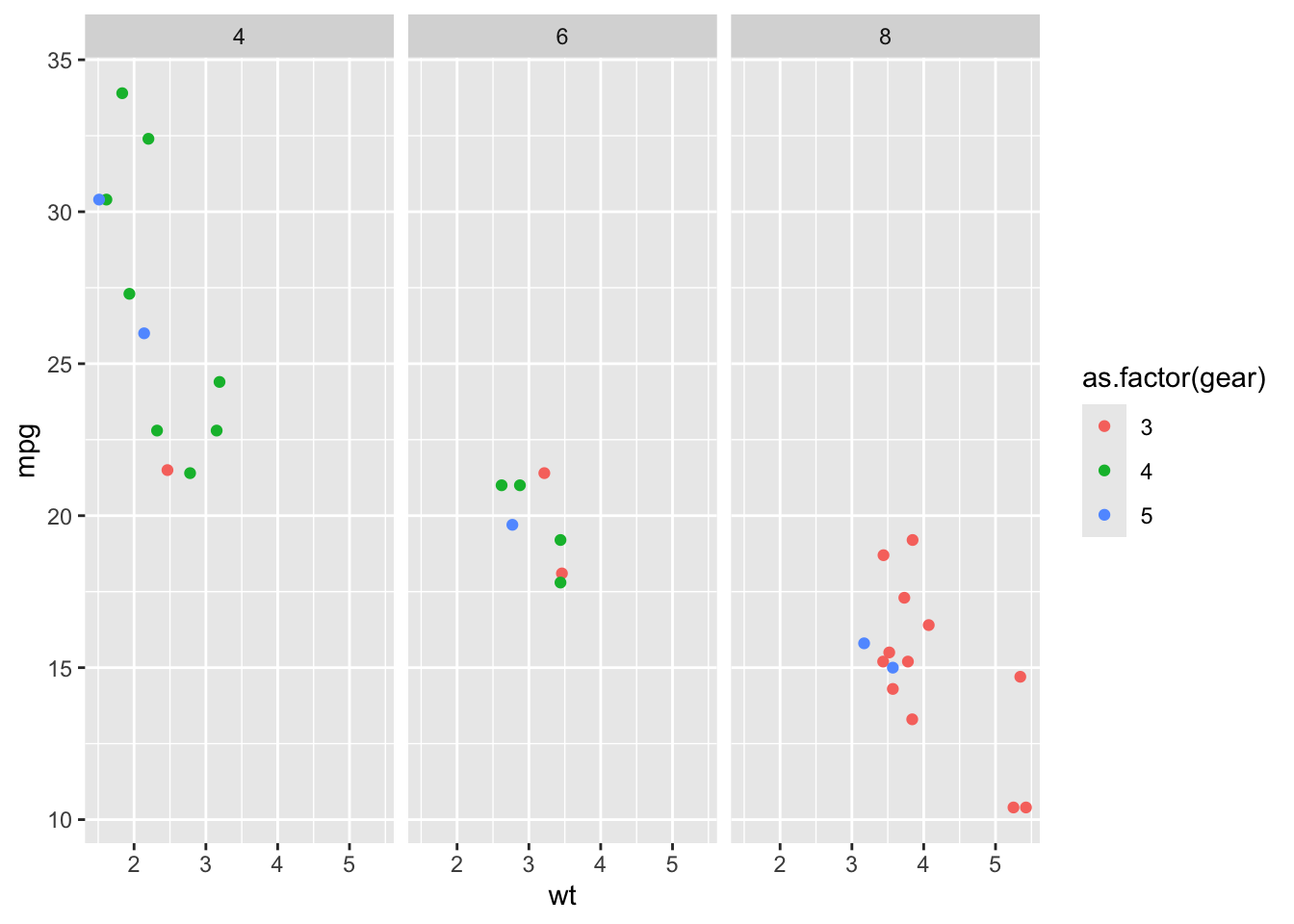
Code
ggplot(data = mtcars) +
  geom_point(aes(x = wt, y = mpg, color = as.factor(gear))) +
  facet_wrap(~cyl)
2.2 Exercise 2
Objective: Create a boxplot of diamond prices (price) for each diamond cut (cut). Facet the plot by diamond color (color).
Here is the output you should be getting:
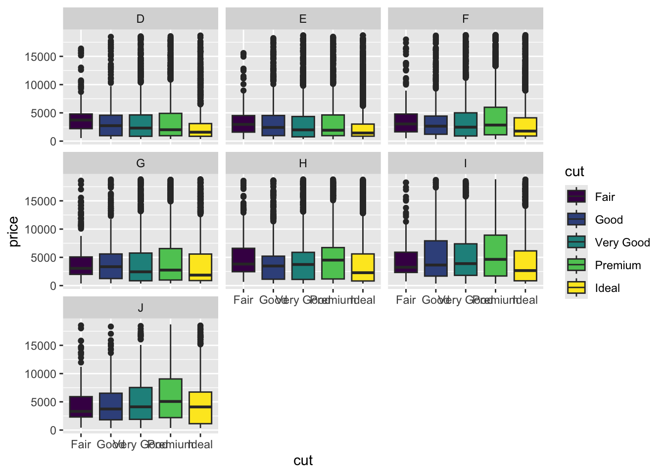
Code
ggplot(data = diamonds) +
  geom_boxplot(aes(x = cut, y = price, fill = cut)) +
  facet_wrap(~color)
2.3 Exercise 3
Objective: Plot the progression of weight (weight) over time (Time) for each chick using a line plot. Facet the visualization by the diet type (Diet).
Here is the output you should be getting:
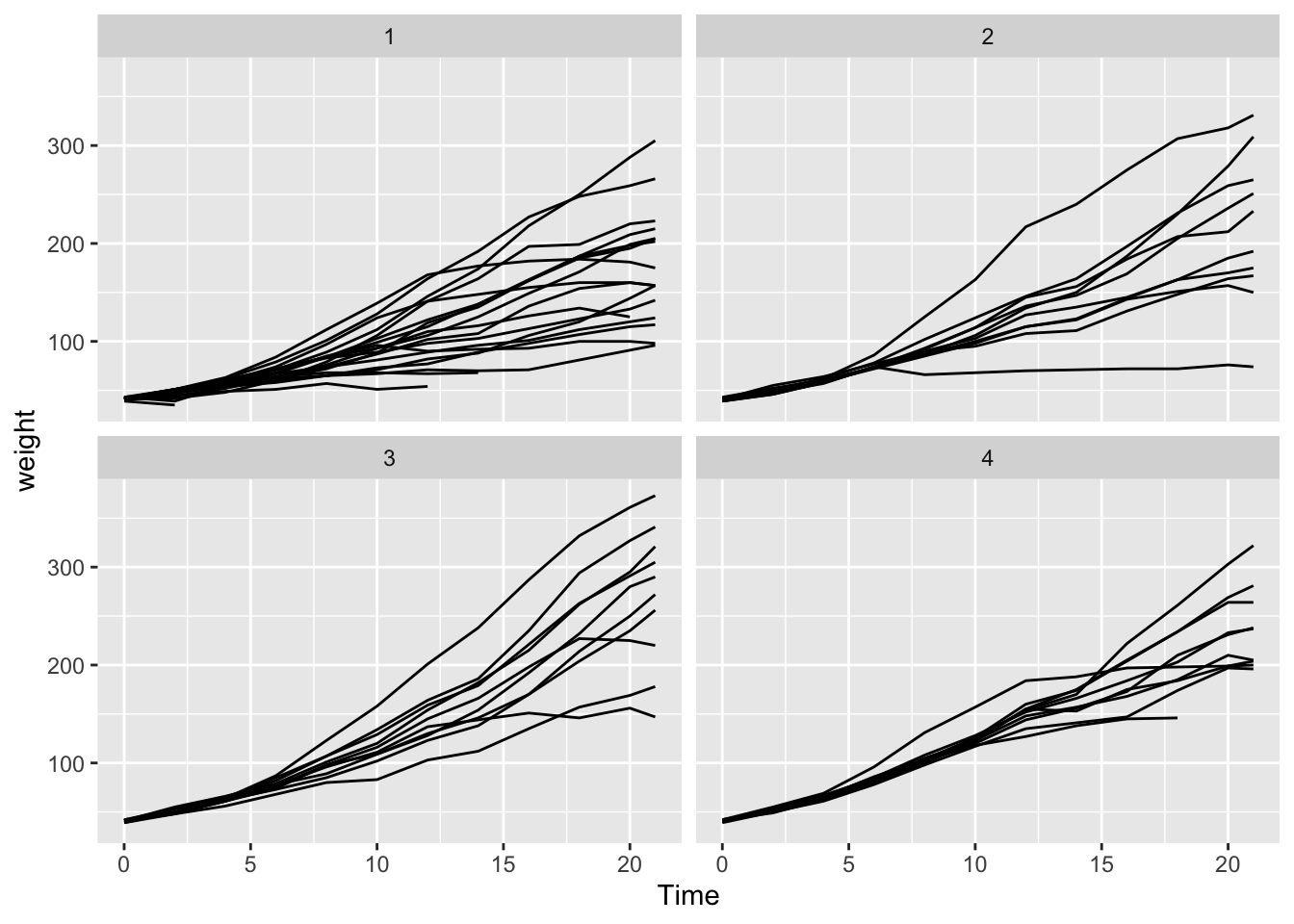
Code
ggplot(data = ChickWeight) +
  geom_line(aes(x = Time, y = weight, group = Chick)) +
  facet_wrap(~Diet)
2.4 Exercise 4
Objective: Create a scatter plot of highway miles-per-gallon (hwy) against engine displacement (displ). Facet the plot by the drive type (drv), with different panels for each type of drive (front-wheel drive, rear-wheel drive, and four-wheel drive).
Here is the output you should be getting:

Code
ggplot(data = mpg) +
  geom_point(aes(x = displ, y = hwy, color = class)) +
  facet_wrap(~drv)
2.5 Exercise 5
Objective: Plot a boxplot showing the count of insects (count) for each spray type (spray). Facet the plot by spray type (spary).
Here is the output you should be getting:
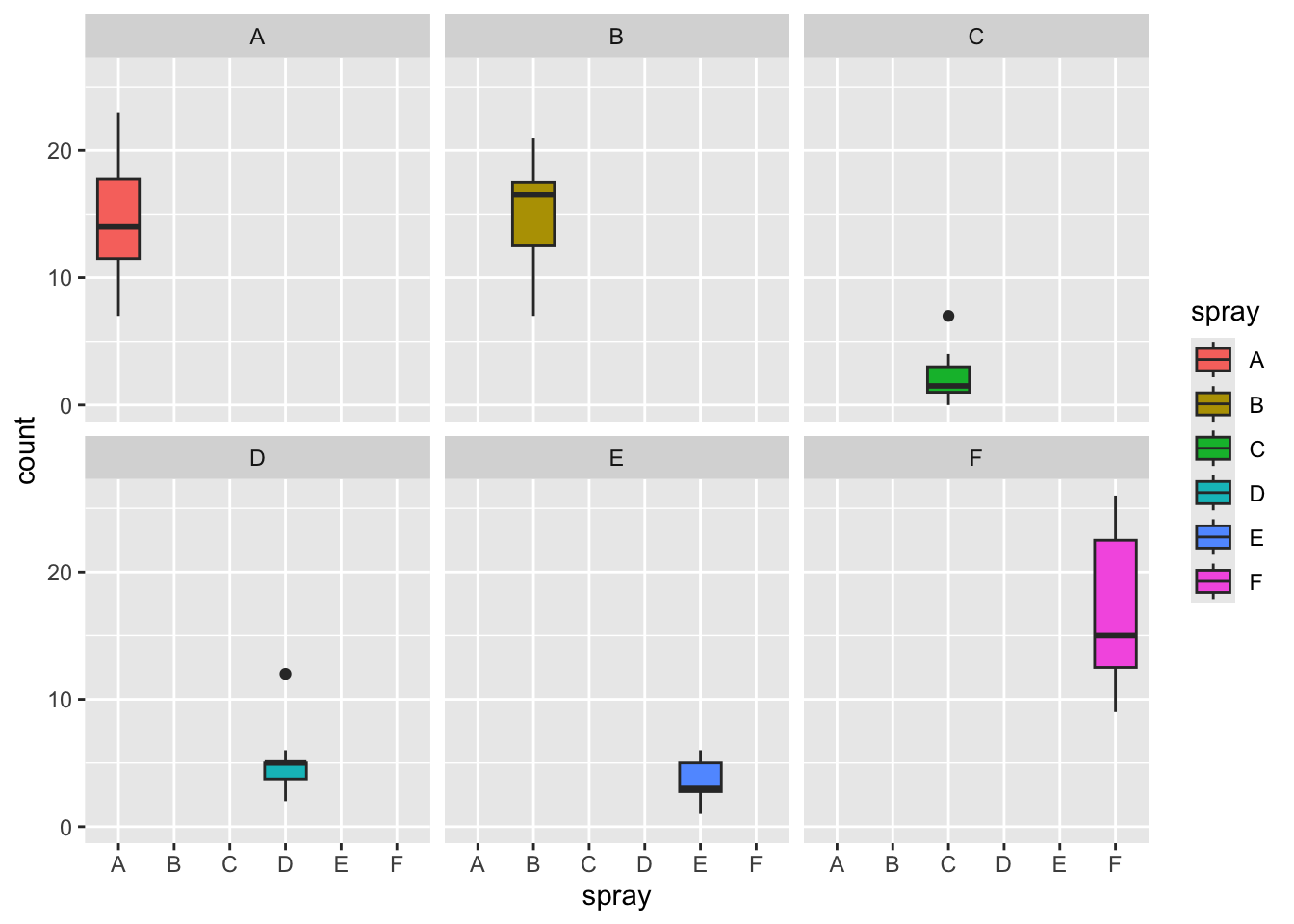
Code
ggplot(data = InsectSprays) +
  geom_boxplot(aes(x = spray, y = count, fill = spray)) +
  facet_wrap(~spray)