The very first thing you need, when you want slides instead of a document, is to tell Quarto which format to produce, and that happens in the YAML header at the top of the file. The one line that matters most here is the format declaration: setting the format to revealjs. That single word is what switches Quarto from producing an ordinary HTML page or a PDF to producing a reveal.js slide deck. Everything indented underneath revealjs is just an option that tweaks how the slides look and behave: the theme, the font size, whether the code is echoed, and so on. Don’t try to memorize every option today. The key idea is simply that the format declaration is what turns an ordinary qmd file into a presentation. Read the example from the top. The title line supplies the presentation title. The theme list starts with the default reveal.js theme and then adds the course’s custom and notebook stylesheets in that order. Fontsize at one-point-two em sets the base text size. Callout-icon false removes the standard icons from callout boxes, and scrollable true lets a slide scroll when its content is taller than the screen. Echo true displays the R code as well as its result, while fig-d-p-i four hundred asks for high-resolution figures. Because these are in the YAML header, they become deck-wide defaults rather than settings you repeat on every slide.
To create a presentation with Quarto, the first thing to do is declare the revealjs format in the YAML header of the qmd file, as below:
---
title: "02-2 Using Quarto to Create Presentations"
format:
revealjs:
theme: [default, ../custom.scss, ../notebook.scss]
fontsize: 1.2em
callout-icon: false
scrollable: true
echo: true
fig-dpi: 400
---Note
format needs to be specified as revealjsrevealjs-specific options below revealjs: (we will look at various options later).Once Quarto knows you want slides, the next question is how you actually make a new slide, and the answer is headers. A level-one header, a single hash, starts a big section-divider slide, with the title sitting centered, like a chapter break. A level-two header, two hashes, starts an ordinary content slide with the title tucked up in the top-left corner. My advice, which you’ll also see in the callout, is to use a single hash sparingly, just for the few big transitions in your talk, and a double hash for all the regular slides. The payoff comes when you press the letter o for the overview: your section titles stand out from the ordinary slides, and you can take in the shape of your whole talk at a glance. Here, the level-one title is centered vertically while the text remains left-aligned. The Direction callout points you to zero-two-one-Quarto-introduction-dot-q-m-d so you can inspect a complete source deck.
You can start a new slide using either # or ##.
Use # (level 1 header)
By default, this creates a new slide with new section title left-aligned and vertically centered.
Use ## (level 2 header)
By default, this creates a new slide with new slide title in the top-left corner.
Suggestion
Use # for the handful of section breaks that divide your talk, and ## for the ordinary slides inside each section. That way the section titles stand out when you open the overview (press o).
Direction
Look at 02-1-Quarto-introduction.qmd.
Here’s the reassuring part. You already know how to embed R code and its output from the earlier lectures, and none of that changes just because we’re making slides now. You write a code chunk in exactly the same way, the code runs, and its results appear on the slide. The one thing I’d point you to is the recommended settings in the callout: for a research talk you usually want to hide the code itself and silence the messages and warnings, so your audience sees the result — the figure or the table — and not the plumbing behind it. Put echo false, message false, and warning false in your YAML header once, and it applies to the whole deck. The top-level execute key groups those options as rules for running code throughout the presentation. Echo false hides the source lines, message false removes routine package messages, and warning false removes warnings from the audience-facing slides. You still see the figure or table produced by the chunk, which is why these settings reduce distraction without removing the result you actually want to present.
We have already learned how to do this. The way we include R codes is consistent across different output formats, including presentations with revealjs.
So you’ve rendered your slides and you’ve got an HTML file. Now what? You open it in a browser, and it behaves like any presentation tool you’ve used. The Right Arrow key or the Space bar moves you forward, and the Left Arrow key moves you back. Press f to go full screen so the browser chrome disappears. The two I really want you to remember are o, or escape, which zooms out to show every slide at once so you can click to jump anywhere, and m, which pulls up a menu listing all your slides by title. And if you forget all of this, just press the question-mark key during the talk and reveal.js shows you the complete list. So there’s really nothing to memorize here.
Open the rendered html in a browser and use:
The one to remember
Press ? during a presentation to see every available key. You do not need to memorize the list.
These next two are the ones that make you look like you know what you’re doing in front of a room. Press s and reveal.js opens a second window, speaker view, with your notes, a running timer, and a preview of the next slide. You put that on your laptop and the main slides go on the projector. The other one is b, or the period key, which blanks the screen to black. That sounds trivial, but it’s genuinely useful: when you want the room to stop reading your slide and actually look at you while you explain something, you black the screen. One caution, in the callout: speaker view opens a pop-up window, so if nothing happens when you press s, your browser has probably blocked it and you need to allow pop-ups for that page.
Speaker view and pop-ups
Speaker view opens a second browser window. If nothing appears, your browser blocked the pop-up; allow pop-ups for the page and press s again.
Sometimes the situation calls for a PDF: a conference wants you to upload one, or a colleague asks you to email your slides and you’re not sure they can open reveal.js. The trick is to open the rendered HTML in Chrome specifically, press e to switch into print view — watch how the slides reflow into flat pages — and then just print, choosing Save as PDF as the destination. The one thing to accept, as the callout warns, is that anything animated is lost. Incremental lists show up fully revealed, and code that highlights line by line collapses into a single block. A PDF is a snapshot, not a performance.
Sometimes you have to hand in or email a PDF rather than the slides themselves.
Note
Anything that depends on motion is lost in a PDF: incremental lists appear fully revealed, and progressive code highlighting collapses to a single block.
Now we get into the features that make slides feel like slides. The first is the incremental list. Instead of your three bullet points all appearing at once — which invites the audience to read ahead and stop listening to you — you wrap the list in a div marked incremental, and now each bullet appears on its own click. You control the pace, and their attention follows your clicks. The code is on the left. The right side is deliberately empty right now — press the right arrow and watch the points arrive one at a time.
The incremental trick is great, but it only works on lists. What if you want to reveal a figure, or a callout box, or a single paragraph, one step at a time? That’s what fragment is for — it’s the general-purpose version. You wrap any element, anything at all, in a div marked fragment, and it stays hidden until you click. Stack several of them and you reveal a slide piece by piece, in whatever order you like. So the rule of thumb is: incremental for lists, fragment for everything else.
.incremental works on lists. To reveal any element one step at a time, wrap it in a .fragment div:
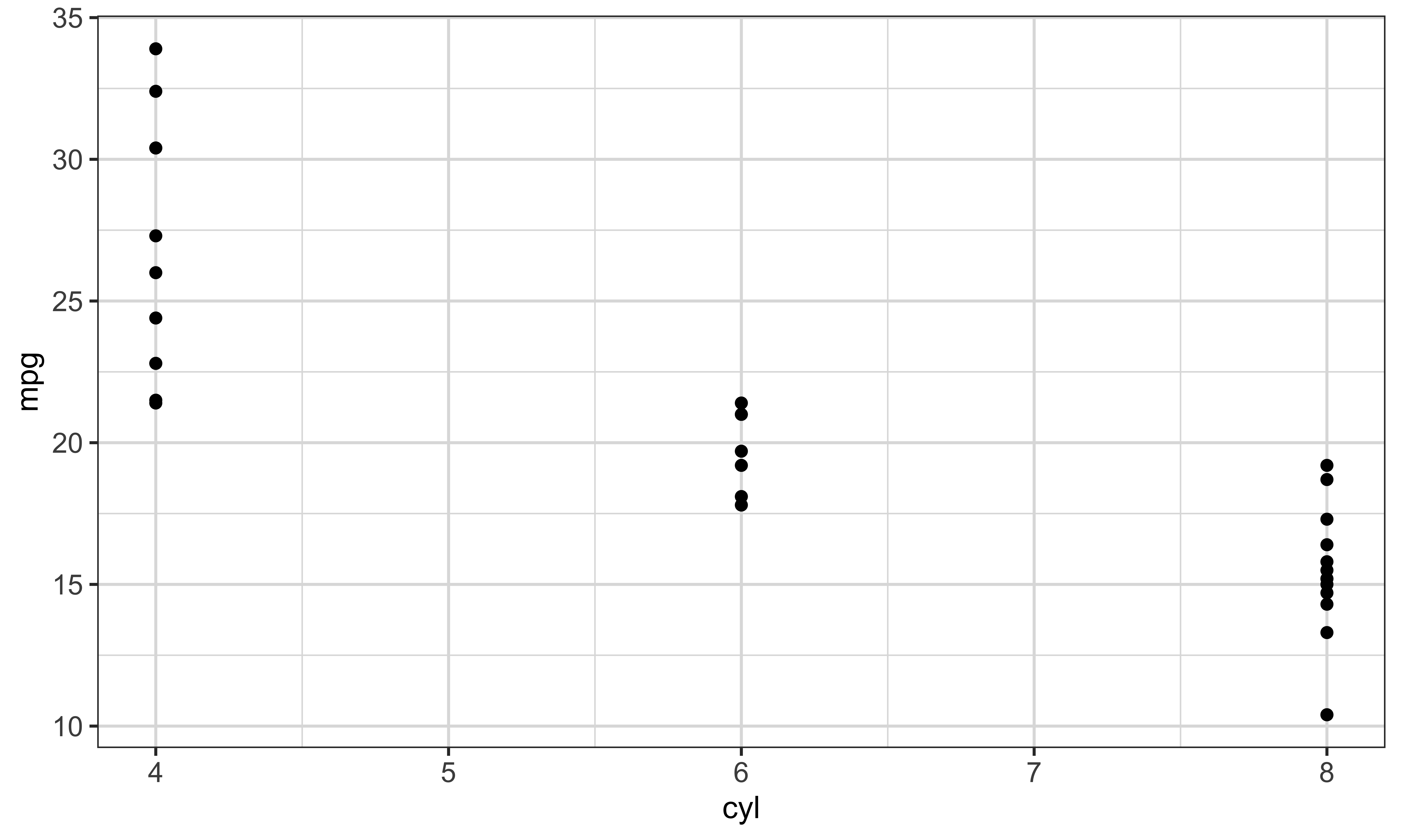
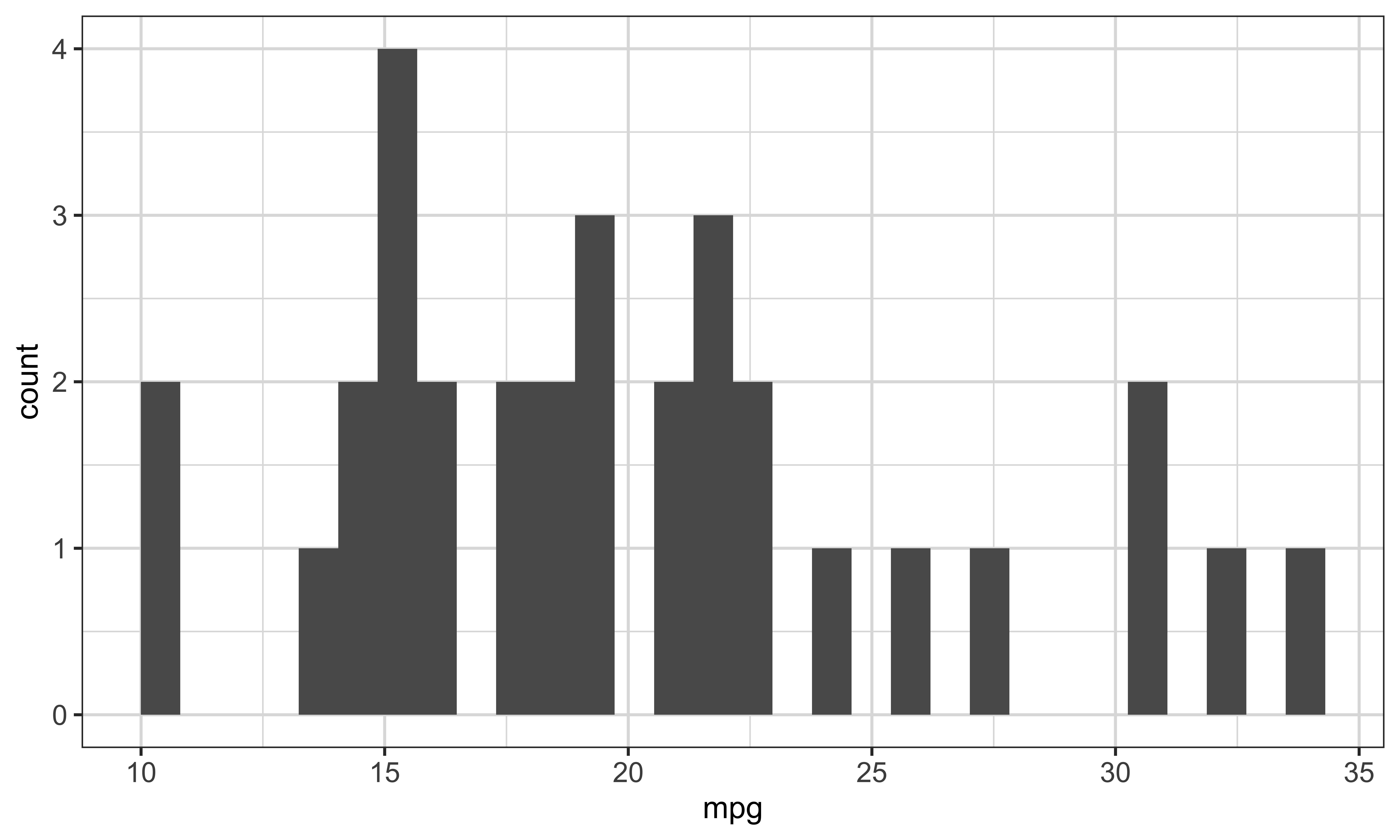
A very common layout need is two things side by side: a plot on the left and an explanation on the right, or two plots to compare. Reveal.js gives you a columns layout for this. You open an outer columns block, and inside it you put one column div for each column, each with a width. Look closely at the code, because there’s a subtlety here that trips up almost everyone, and it’s important enough that I gave it its own tab, right next door. The example makes those widths concrete. The first inner column takes forty percent of the available width and uses mtcars to draw a point plot with cylinders on the horizontal axis and miles per gallon on the vertical axis. The second takes the remaining sixty percent and draws a histogram of miles per gallon. The widths add to one hundred percent, so you are explicitly dividing the slide between the two pieces of content. The plus signs add each geometry to its ggplot, and aes tells ggplot which variables belong on the axes. Flip to Output to see those same column containers place the two rendered plots side by side, then move to Why four colons for the nesting rule that keeps the layout intact.
Here’s the subtlety. Look at the colons. The outer columns block uses four colons, and the inner column blocks use three. That is not a typo, but here it is a clarity convention rather than a parsing requirement. Equal three-colon fences also parse correctly in this layout. Using more colons on the outer block makes the nesting boundaries easier to read and helps you see which closing line belongs to which block. The exact numbers don’t matter, so five outside and three inside works just as well. When you see four on the outside and three on the inside, read that as a deliberate visual nesting signal.
Notice the outer block uses four colons and the inner blocks use three.
Important
Using four colons outside and three inside makes the nesting easier to read, even though equal three-colon fences also parse correctly here.
Every so often you’ll build a slide that just has too much on it, and content spills off the bottom edge. You have two clean ways to handle it. One: shrink the text on just that slide by adding smaller, in curly braces, after its title. Two: let that one slide scroll by adding scrollable. You can also turn scrolling on for the entire deck from the YAML header, and in fact this presentation does exactly that. But my advice, in the callout, is to prefer the per-slide version. A scrolling slide is easy for an audience to miss content on, so it’s better to fix the two or three slides that actually need it than to make every slide scrollable.
Two ways to deal with a slide whose content does not fit.
1. Shrink the text on that slide
2. Let that slide scroll
Or turn scrolling on for every slide from the YAML header:
Prefer the per-slide version
Turning scrollable on for the whole document is convenient, but a scrolling slide is easy for an audience to miss content on. Adding {.smaller} or {.scrollable} to the two or three slides that need it is usually the better answer.
Direction
scrollable: true is enabled in this presentation. Add enough text to a slide of your own to push past the bottom edge, and watch the scroll bar appear.
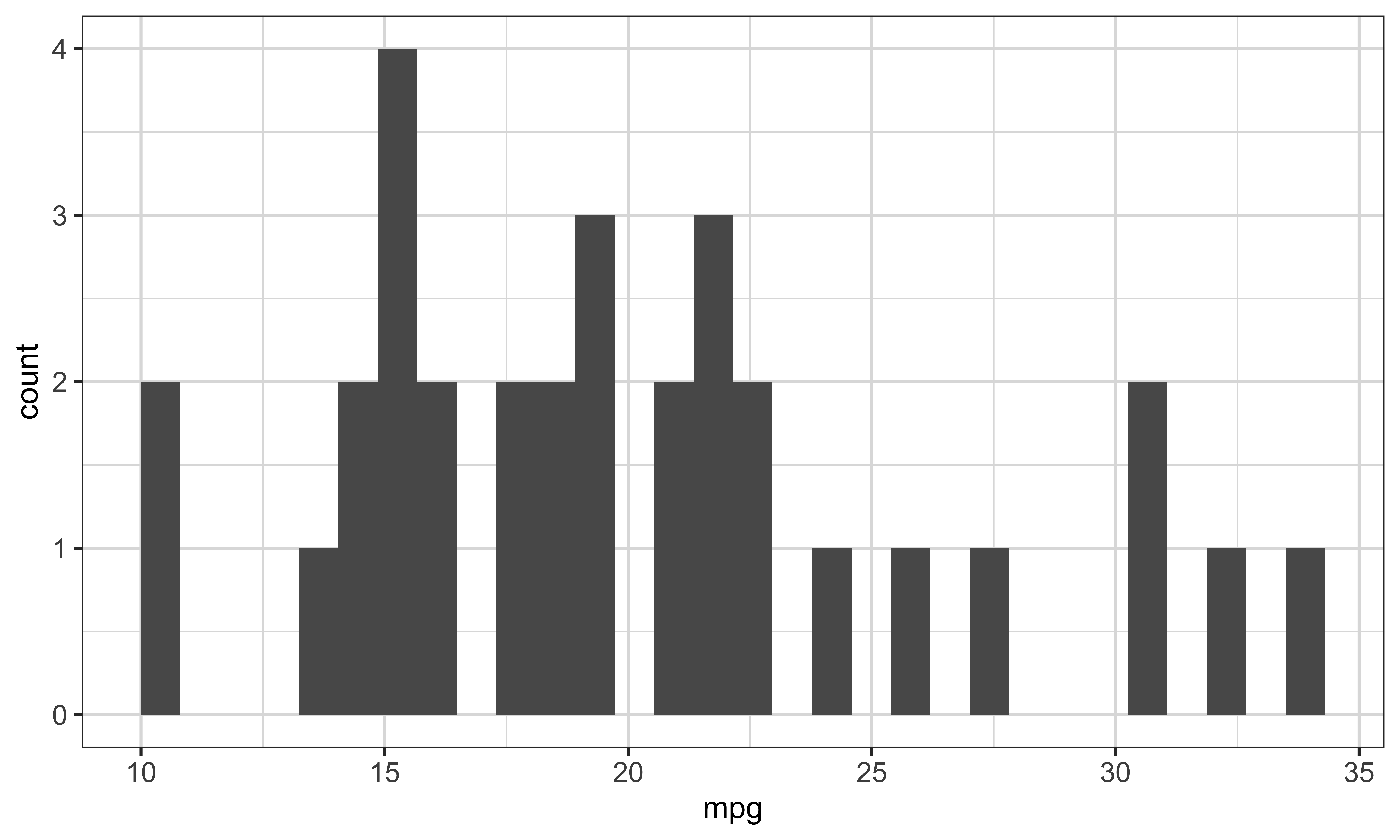
This is the other half of the speaker-view feature we saw earlier. You attach private notes to any slide by adding a div marked notes. The audience never sees them — go ahead and look, they’re invisible on the slide right now — but when you press s for speaker view, your notes appear on your private screen. This is where you put the reminder to yourself: mention that the y-axis is a count, not a share, that kind of thing. The syntax is right there in the code block below, and if you press s now, you’ll see the hidden note attached to this very slide. The R chunk above the note is ordinary audience-facing content: ggplot starts with mtcars, and geom-histogram maps miles per gallon to the horizontal axis, so the bars count cars within mileage ranges. The notes block that follows belongs to the same slide but sends its text only to speaker view. That separation is useful because the visual and your private reminder stay together in the source without putting the reminder in front of the audience. The Try callout repeats the action: press s, allow the pop-up if needed, and inspect the note in the speaker window.
Add notes to any slide with a .notes block:
Try
Hitting the “s” key will generate a pop-up window with speaker view.
Three small touches that make a deck look finished, all set from the YAML header. The logo option puts an image in the corner of every slide — this deck uses the Nebraska N, which is why you see it in the bottom-right. The footer option runs a line of text along the bottom of every slide, handy for a course number or your name. And slide-number set to true numbers your slides, which matters more than you’d think in a seminar, because it lets someone say go back to the plot on slide twelve instead of that one from a while ago.
You can add a logo with the logo option under revealjs:.
This presentation uses the code below in its YAML header, which is why the logo appears in the bottom-right corner.
Two companions to logo that are worth knowing:
footer: a line of text along the bottom of every slideslide-number: true: shows the slide number, so your audience can refer to oneHere’s a feature I’ve been using on you this entire lecture without pointing it out: tabs. Every one of these slides where you click between Code and Output is a tabset. You make one by wrapping your content in a panel-tabset div, and each header inside becomes a tab. The one rule to get right, in the callout, is that the header level inside the tabset has to be exactly one step below the slide’s own header. So on a double-hash slide, your tab names use triple-hash. Get that level wrong and, instead of tabs, you’ll accidentally create brand-new slides, which is a confusing thing to debug.
You can create tabs using the following code:
Note
The header level inside the tabset must be one step below the slide’s own header. On a ## slide, use ### for the tab names.
This next feature is, for a data science course specifically, maybe the most useful one in the whole lecture. The problem it solves is this: when you throw a fifteen-line block of code up on a slide, the audience reads all of it at once, gets ahead of you, and stops listening. What you actually want is to reveal and highlight the code the way you’d explain it, one piece at a time, so their eyes follow your voice. That is exactly what code-line-numbers does.
When you show a block of code, the audience reads all of it at once and stops listening. code-line-numbers lets you reveal and highlight it a piece at a time, so their attention follows yours.
The mechanism is a single chunk option, code-line-numbers, and you give it a string where each group separated by a vertical bar is one click. So the string bar-one-bar-two-bar-three means: first show the whole block with nothing highlighted, then highlight line one, then line two, then line three. You can group lines too — one-dash-two-bar-three highlights the first two lines together, then the third. And that leading bar, the one before the first number, means start with nothing highlighted, which gives you a clean first look at the whole block before you begin walking through it. The three numbered lines are a real pipeline, not filler. Mtcars enters the first pipe, filter keeps only rows where cyl equals four, and the next pipe hands those rows to summarize. Mean of mpg calculates their average miles per gallon, and mean-m-p-g names the one summary column. Those are the three steps the option highlights in sequence. Move to Output to click through the working version and see the value that pipeline returns.
Each group separated by | is one click.
```{r}
#| code-line-numbers: "|1|2|3"
mtcars %>%
filter(cyl == 4) %>%
summarize(mean_mpg = mean(mpg))
```"|1|2|3": first the whole block unhighlighted, then line 1, then line 2, then line 3"1-2|3": first lines 1 and 2 together, then line 3| means “start with nothing highlighted”Here’s the same thing running. Click through it and watch: the whole pipeline appears first, then, line by line, it highlights — the data, then the filter, then the summarize. This is exactly how I’d talk you through a pipeline out loud, and now the highlighting is doing the pointing for me. This is the one feature I’d most encourage you to steal for your own presentations of code. The printed output is one row with a column named mean-m-p-g and the value twenty-six-point-six-six-three-six-four. That is the average mpg among the four-cylinder cars selected by the middle line. The output confirms what the pipeline computed, while the changing highlight controls where the audience looks as you explain how it got there.
When you put a figure on a slide, the two options you’ll reach for most are out-width, which controls how big the figure appears on the slide, and fig-align, which controls whether it sits left, center, or right. Those two get you most of the way. There’s a full reference linked here for everything else, but let’s look at a few concrete examples so you can see the effect for yourself.
You can use
out-width to control the size of the figure as displayed on the slidefig-align to control the alignment of the figureSee here for all the options available.
Here’s out-width set to 100 percent. The figure fills the full width available on the slide. Flip between the Code tab and the Output tab and just note the relationship: the number in the code, and the size on the slide. The plotting code uses mtcars as the data, maps mpg to the horizontal axis inside aes, and adds geom-histogram, so each bar counts cars in a range of miles-per-gallon values. We will keep that plot unchanged across all three examples. That way, any change you see comes from the display options rather than from a different dataset or geometry. The next tab reduces the width and introduces alignment.
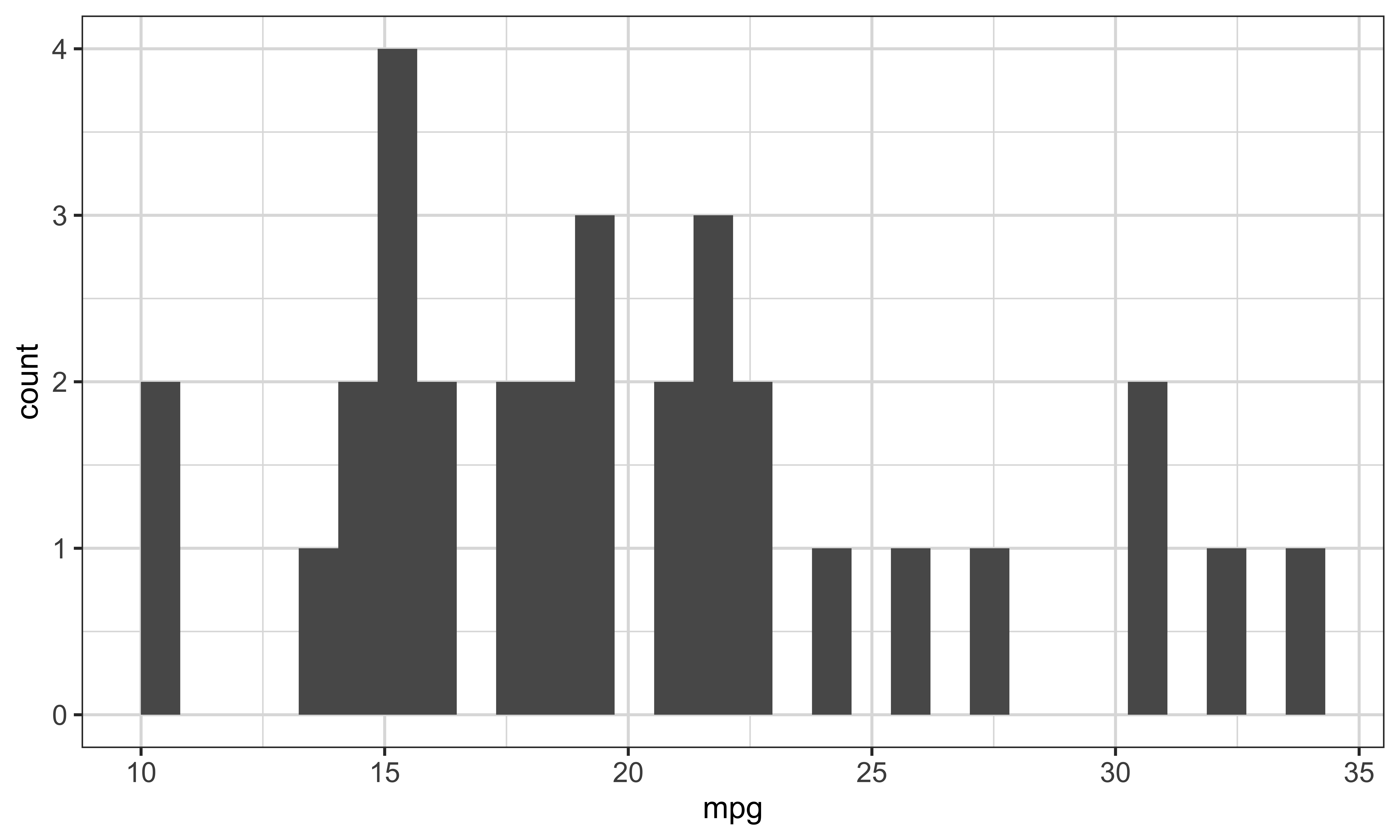
Now out-width is 80 percent and I’ve added fig-align center. So the figure is a bit smaller than full width, and it’s centered on the slide. This is probably the most common combination you’ll actually use for a single plot. The ggplot, mtcars data, mpg mapping, and histogram geometry are exactly the same as in Example 1. Eighty percent leaves some unused horizontal space, and center divides that space between the two sides. Keeping the plot code fixed lets you see that out-width changes display size and fig-align changes placement. In the next example, we make both effects more obvious.
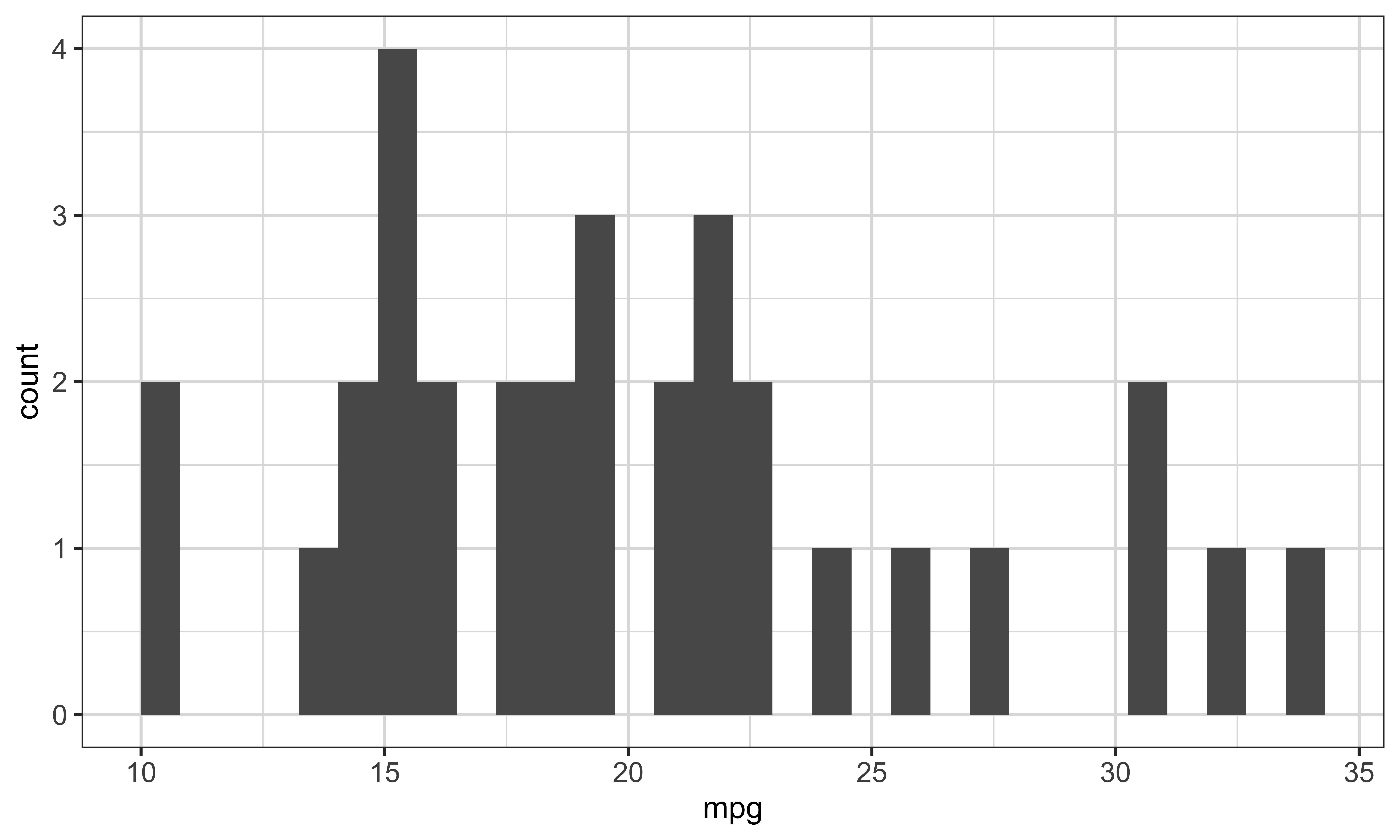
And here it’s shrunk further, to 50 percent, and pushed to the right with fig-align right. I’m showing you the extremes on purpose so the effect is obvious. But notice something as the plot gets smaller: the axis labels are getting harder to read. Hold that thought, because the next tab is about exactly that problem. The data and plot are still unchanged: ggplot starts from mtcars, aes maps mpg to the horizontal axis, and geom-histogram counts cars within mileage ranges. At fifty percent, the finished image uses half the available width, and right alignment places the unused space to its left. Because only the output options changed, the smaller labels you see are evidence that out-width scales the whole finished image.
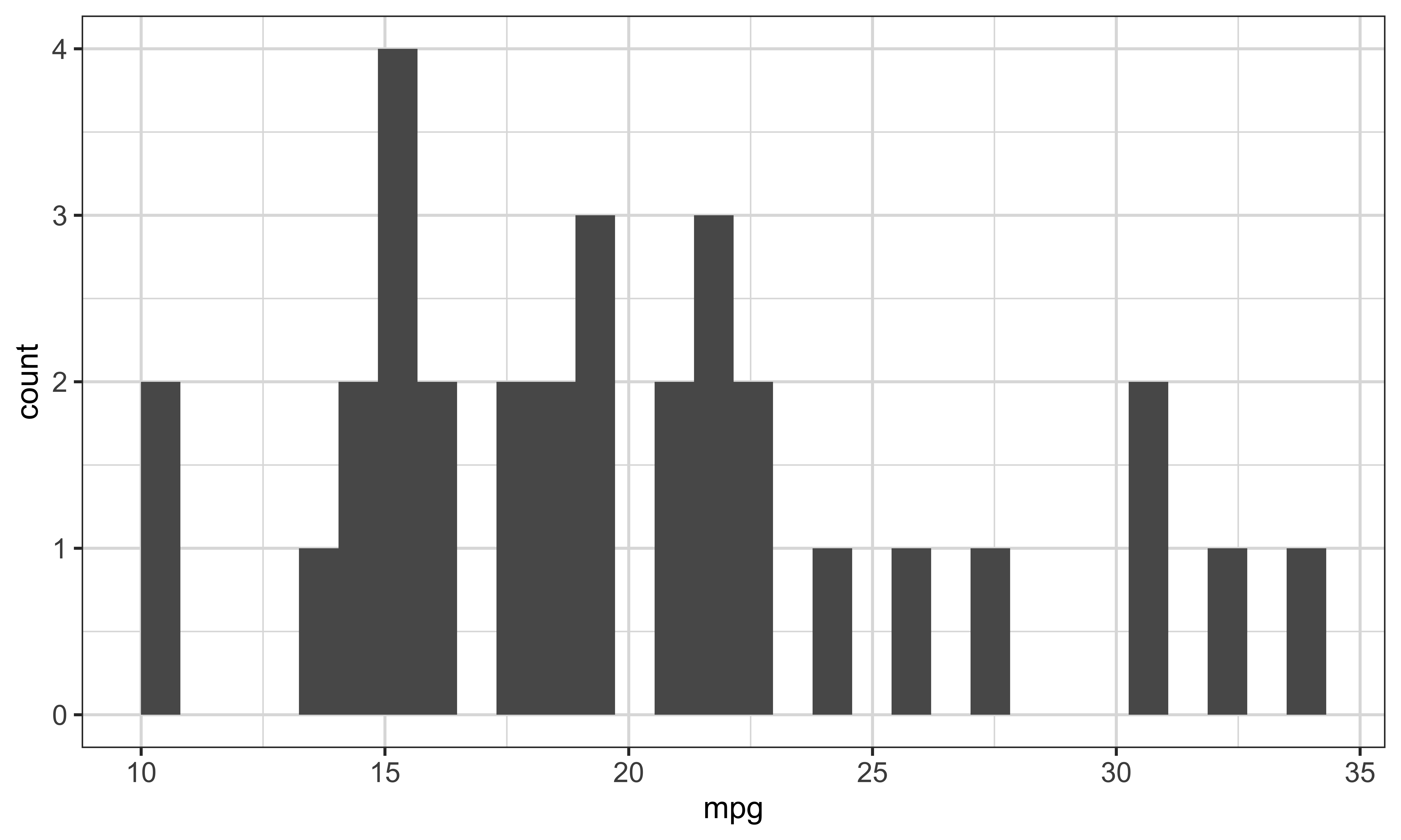
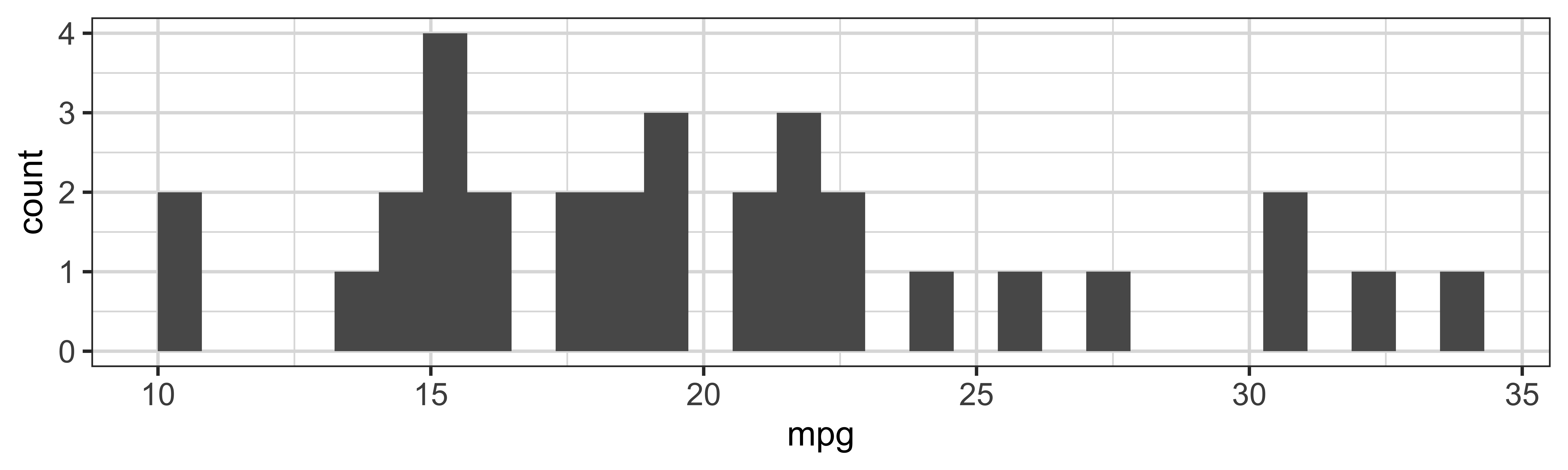
This is the distinction that causes the most confusion, so let’s be careful. There are two pairs of options that both sound like they control size, but they do different jobs. fig-width and fig-height set the size of the canvas R draws the plot on, in inches, and that decides how big the axis text and points look relative to the plot. out-width and out-height set how big the finished image is displayed on the slide, and that scales the whole picture, text and all. Here’s the practical consequence, and it’s the thing to take away: if your axis labels are too small to read from the back of the room, do not reach for out-width to make the plot bigger, because that scales the tiny text right along with it. Instead, lower fig-width. A smaller canvas makes the text larger relative to the plot, and then the whole thing scales up cleanly. The last two tabs show how to match the drawn and displayed size exactly, and remind you that fig options are always in inches while out options need a unit. Read the matching example as two stages. Fig-width ten and fig-height three ask R to draw a wide, shallow ten-by-three-inch canvas. Out-width ten-in and out-height three-in then request matching display dimensions. The ggplot code uses mtcars and draws the same mpg histogram as the previous examples, so the Output tab isolates the effect of those four size settings. In the callout, notice the syntax difference: fig options use plain numbers because inches are assumed, while out options must say a unit explicitly, such as ten-in, or use a relative size such as eighty percent.
fig-width and fig-height set the size of the canvas R draws on, in inches. This decides how large the axis labels and points look relative to the plot.
out-width and out-height set how large the finished image is displayed on the slide. This scales the whole picture, text and all.
The practical consequence
Making a plot smaller with out-width shrinks the text along with it. If your axis labels are too small to read from the back of the room, do not raise out-width. Lower fig-width instead: a smaller canvas makes the text larger relative to the plot, and then the whole thing scales up cleanly.
If you want the image displayed at exactly the size it was drawn, give the out- options the same numbers with in attached:
```{r}
#| fig-width: 10
#| fig-height: 3
#| out-width: 10in
#| out-height: 3in
ggplot(data = mtcars) +
geom_histogram(aes(x = mpg))
```Note
fig- options take a plain number and the unit is always inches.out- options need a unit, so write 10in, or use a percentage such as 80%.Reveal.js ships with a whole set of ready-made themes, and switching between them is a one-line change. You set the theme option in your YAML header to the theme’s name, like dark, and the entire look of the deck changes. There’s a link here to the full list. The direction in the callout is just to try one and watch what happens — it’s the fastest way to see how much the theme controls.
There are many pre-made themes that you can apply to revealjs presentations. See the list here.
You can set a theme using the theme option in the YAML header like below:
Direction
Try one of the themes listed and see how the appearance of the presentation changes.
A pre-made theme gets you close to what you want, but usually not exactly. To change the details, you write your own scss file and give Quarto a theme list. The order matters here: default is applied first, custom dot s-c-s-s overrides default, and the later notebook dot s-c-s-s can override both. And this isn’t hypothetical: every single lecture in this course is built exactly this way, with a file called custom.scss, and it’s genuinely worth opening to see how it’s done. The list on screen shows all three stylesheets. Quarto reads the list in order: default supplies the base, custom dot s-c-s-s overrides the base, and notebook dot s-c-s-s has the final precedence. Splitting custom rules across files can keep different kinds of styling separate. The live-example callout points to lectures slash custom dot s-c-s-s so you can inspect the course’s own overrides rather than starting from an empty file.
A pre-made theme gets you close. To change details, you write your own scss file and give Quarto a theme list:
default is applied firstcustom.scss overrides defaultnotebook.scss can override bothA live example
This is exactly what every lecture in this course does. The file is lectures/custom.scss, and it is worth opening.
Scss-defaults and scss-rules are two common labelled sections in a Quarto theme file, and knowing the difference saves you a lot of frustration. The scss-defaults section is for variables, the colors and fonts the whole theme is built from. If you want to change your link color across the entire deck, you set a variable here. The scss-rules section holds ordinary CSS rules, applied last, and it’s for targeting one specific thing, like make my level-two headers orange. Rough rule: defaults for the deck-wide look, rules for one-off targeting. In the exact example, body-color is set to hash-two-two-two, a near-black for the main text, and link-color is set to hash-zero-six-a-six-six-six, a green used for links. Below the rules marker, reveal h-two targets level-two headings inside the reveal.js deck, and its color is set to the orange hash-f-five-nine-two-one-nine. Variables give the theme values it can reuse consistently, while the targeted rule is useful when you want one element to depart from those broad defaults.
An scss file can have two labelled sections, and the difference matters:
/*-- scss:defaults --*/
$body-color: #222;
$link-color: #06a666;
/*-- scss:rules --*/
.reveal h2 {
color: #f59219;
}scss:defaults sets variables that the theme is built from. Use it for the colors and fonts of the whole deck.scss:rules holds ordinary CSS rules, applied after everything else. Use it to target one specific thing.So how do you know what to write in that rules section? You let the browser tell you. Right-click the thing you want to change, choose Inspect, and read off the class name the browser shows for that element. Then you write a rule for that class in your scss-rules section. That’s the whole workflow: inspect, read the class, write the rule. You don’t have to know reveal.js’s internals by heart — the browser hands you the target. Read the example selector from left to right: reveal limits the rule to the presentation, panel-tabset narrows it to a tabset, and role equals tab selects the actual tab controls. Font-size zero-point-eight-five em makes those controls eighty-five percent of the size they would otherwise inherit. That precise selector matters because it shrinks the tab labels without also shrinking unrelated headings or body text.
To change the look of something on a slide:
scss:rules sectionHere’s a small exercise to make this concrete. Make a file called my-theme.scss next to your qmd, put in a rule that colors your level-two headers red, point your YAML at it with theme default plus my-theme.scss, and render. Every level-two slide title should turn red. Once you’ve seen your own rule take effect on the real deck, the whole custom-theme idea stops being mysterious.
Here’s a gotcha that bites people constantly. In a website project, the rendered my_talk.html may depend on both a deck-specific my_talk_files folder, which holds generated figures, and the project’s shared site_libs directory, which holds reveal.js and other support files. If you email just the HTML file, which feels like the natural thing to do, the person may open a broken page because you left those dependencies behind. And this bites harder for slides than for a normal report because the presentation framework is one of those shared dependencies.
In a website project, the rendered output may depend on:
my_talk.htmlmy_talk_files/, which holds deck-specific figures and other generated assetssite_libs/ directory, which holds the revealjs machinery and other support filesSend only the html file and the recipient may get a broken page because those dependencies remain in the project folders.
As you saw in 02-1, the fix is one line: embed-resources set to true in your YAML header. That tells Quarto to embed linked static assets, including figures, fonts, and stylesheets, in the single HTML file. Dynamically loaded features such as speaker notes or zoom may still fail offline, so test those features before you distribute the deck. The trade-off, in the callout, is that the file gets noticeably bigger and takes a moment longer to open.
Linked static assets are embedded in the single html file, but dynamically loaded features should be tested offline before distribution.
Note
The file gets noticeably larger, and self-contained slides take a moment longer to open. That is the trade-off for embedding linked static assets.
And here’s how you make sure before you hit send. Render, then move only the HTML file to your Desktop, away from its folder. Open it there and click through a few slides. If the figures and the styling survive the move, you know the linked static assets are embedded. Also test dynamically loaded features such as speaker notes and zoom before you send it. If the static assets break, check the embed-resources line. Thirty seconds of checking saves you an embarrassing follow-up email.
.html file to your DesktopIf the figures and styling survive, the linked static assets are embedded. Test dynamically loaded features such as speaker notes and zoom offline before sending.
That’s the tour. Where do you go from here? The single best resource is the official Quarto documentation for reveal.js — it’s thorough and well organized, and it’s linked right here. There’s a second link for the more advanced features we didn’t cover today, and a third to the full list of YAML options, which is the page you’ll actually keep open once you start customizing your own decks. Everything I showed you today is in there, plus a great deal more.