00: Introduction to Econometrics

What is econometrics about?


What econometrics is about

Transcript

Let’s start with the simplest possible answer to the question, what is econometrics? We estimate quantitative relationships between variables. Notice the word quantitative. We are not satisfied with saying that two things are connected, or even with guessing whether the connection is positive or negative. We want to measure how large it is, attach uncertainty to that measurement, and ask whether the evidence is strong enough to distinguish the relationship from zero.

Look at the three examples on the screen. For fertilizer and crop yield, we might ask how many additional bushels per acre are associated with, or caused by, one more pound of fertilizer per acre. For political campaign expenditure and voting outcomes, we might ask how a dollar or a percentage increase in spending changes a candidate’s vote share or probability of winning. For education and wages, we might ask how hourly wage changes with one additional year of formal schooling. Each example therefore has an explanatory variable, something that varies and may help explain an outcome, and an outcome variable that we care about.

Every example also contains a distinction that will follow you through the entire course. Measuring how two variables move together is not automatically the same as measuring what would happen if we intervened and changed one of them. Farmers choose fertilizer rates, campaigns choose spending, and people choose education for reasons that can also affect the outcome. We will soon call that the difference between association and causality. These questions matter because the answers guide real decisions about farm inputs, campaign resources, and investments in human capital, which is why somebody would pay money to have them answered well.

What are we doing?

Estimate quantitative relationships between variables.


Examples

  • the impact of fertilizer on crop yield
  • the impact of political campaign expenditure on voting outcomes
  • the impact of education on wage
Transcript

Here is the whole workflow of an empirical project, start to finish. Read the six numbered steps as a sequence, because a mistake early in the sequence cannot usually be repaired by more sophisticated estimation later.

First, formulate the question of interest. You need to say exactly what you are trying to find out, which population you care about, what outcome you will measure, and whether the question is descriptive, predictive, or causal. “Does training help?” is too vague. “What is the causal effect of one additional week of job training on an eligible worker’s hourly wage?” is much closer to something we can analyze.

Second, develop an economic model of the phenomenon. This is where economic reasoning tells you which variables matter and how the relevant people or firms make decisions. Third, turn that conceptual story into an econometric model. You must specify a mathematical relationship, define an outcome, choose explanatory variables, and represent everything left out with an error term. Fourth, collect data that actually measure those objects for the relevant units. Data availability sometimes forces you to revise the question or model, but it should not silently determine the question after the fact.

Only then do you reach the two blue steps. In step five, you estimate the unknown parameters with econometric methods. In step six, you test hypotheses, such as whether a training effect is zero or whether two effects are equal, and quantify the uncertainty in your conclusion. Those last two steps are the main technical focus of this course. That is not because the first four matter less. They matter enormously, and much of serious empirical work is spent on them. It is because estimation and testing are the parts I can teach systematically in this course. Keep the order in mind: clean computation cannot rescue a badly posed question, an implausible model, or data that do not measure what the question requires.

  1. formulation of the question of interest (what are you trying to find out?)
  2. develop an economic model of the phenomenon you are interested in understanding (identify variables that matter)
  3. turn the economic model into an econometric model
  4. collect data
  5. estimate the model using econometrics
  6. test hypotheses

Go through the steps

Transcript

We will walk through those steps with one concrete example: does job training actually make workers more productive? Productivity is difficult to observe directly for many jobs, so this slide uses hourly wage as the outcome. That choice itself is an economic claim: in a competitive setting, more productive workers may be paid more, although in an application you would have to defend how well wage represents productivity.

Step two says to write down an economic model, and the equation reads, wage is some function, called f, of education, experience, and training. Wage means hourly wage. Education is the number of years of formal schooling. Experience is the number of years in the workforce. Training is the number of weeks spent in job training. The notation f says that these inputs jointly help determine wage, without yet committing us to a particular mathematical shape.

Notice what this conceptual model does not say. It does not tell us how much any input matters, whether its effect is positive or negative, whether the effect of an additional week of training is constant, or whether training works differently for workers with different education or experience. It also does not yet distinguish an association from a causal effect. It simply names variables that economic reasoning says belong in the story.

Read the note at the bottom. This list is deliberately short so that we can follow the example. Depending on the question, a credible economic model might also include occupation, industry, tenure, location, age, prior ability, motivation, local labor demand, and interactions among variables. “More involved” should mean guided by the question and economic mechanism, not adding every available column without thought. On the next tab, we make the additional choices needed to turn this conceptual function into an estimable econometric model.

Example: Job training and worker productivity

wage = f(educ,exper,training)

  • wage: hourly wage
  • educ: years of formal education
  • exper: years of workforce experience
  • training: weeks spent in job training

Note

Depending on questions you would like to answer, the economic model can (and should) be much more involved

Transcript

Step three is where the conceptual model becomes something you can estimate. The first line reminds you where we started: wage is an unspecified function of education, experience, and training. To use data, we almost always have to specify the form of that function. Here we begin with a linear and additive form, so the second equation reads: wage equals beta zero, plus beta one times education, plus beta two times experience, plus beta three times training, plus u.

The four betas are unknown parameters. Beta zero is the intercept, the model’s predicted wage when education, experience, and training are all zero. That combination may not describe a typical worker, so the intercept can be necessary for fitting the line without having an interesting standalone interpretation. Beta one is the difference in predicted hourly wage associated with one additional year of education, holding experience and training fixed. Beta two is the difference associated with one additional year of workforce experience, holding education and training fixed. Beta three is the difference associated with one additional week of training, holding education and experience fixed. Their signs describe directions and their magnitudes describe strengths in the units of wage per unit of each explanatory variable. Calling any of them a causal effect will require assumptions that we have not yet earned.

The linear form makes several restrictions. Each slope is constant, effects add together, and there are no interactions unless we put them in explicitly. We start there because it is interpretable and useful, not because every economic relationship is literally a straight line.

Now look hard at the u on the end. This is the error term. It contains all determinants of an individual’s wage that are not represented by the included variables, such as innate ability, motivation, occupation, family connections, local labor-market conditions, measurement error, and luck. The red word “all” is deliberate. The error term is not merely a small random mistake. It is a container for everything omitted from the equation. If one of those omitted factors is related to education, experience, or training, the corresponding estimated slope can mix the variable’s effect with the omitted factor’s effect. That is where much of our econometric trouble begins. With a model written down, the next step is to ask what kind of data we can collect.

We have built a conceptual model:

wage = f(educ,exper,training)

Now, the form of the function f(\cdot) must be specified (almost always) before we can undertake an econometric analysis

wage = \beta_0 + \beta_1 educ + \beta_2 exper + \beta_3 training + u

\beta_0,\beta_1,\beta_2,\beta_3

  • are the parameters of the econometric model.
  • describe the directions and strengths of the relationship between wage and the factors used to determine wage in the model

u

  • is called error term
  • includes ALL the other factors that can affect wage other than the included variables (like innate ability)

We can collect data using various ways. Some of them include survey, websites, experiments. Let’s look at different data types:

Transcript

Step four is data collection. Surveys, websites, administrative records, and experiments can all produce data, but the structure of the resulting data determines which comparisons and econometric methods are available. This first tab shows cross-sectional data. Think of a cross section as a snapshot of many different units, such as individuals, households, firms, farms, cities, states, or countries. Each unit is observed once at a given point, or within a relatively short period that we treat as one point.

The second bullet explains why “at a given point” does not have to mean the exact same instant. A household survey might interview one family in January and another in March. If the research design treats both as observations from the same survey year, the data are still cross-sectional. That approximation becomes questionable if timing within the period systematically changes the variables, so you always need to know how the data were collected.

Look at the R output below. It is the Wage One data set, displayed as a data table. Each row is a different worker, not a different date. The first visible rows are observations one through five, the dots indicate omitted middle rows, and the final visible rows are 522 through 526, so there are 526 workers in total. The type labels under the column names tell you that wage is numeric while the other displayed columns are stored as integers. Wage is hourly wage, education and experience are measured in years, and female and married are indicator variables. A value of one means that description applies and zero means it does not. For example, the first worker has wage 3.10, eleven years of education, two years of experience, is coded female, and is not coded married.

There is no repeated time identifier on this table. Differences in wage are comparisons across different people. That gives us lots of cross-sectional variation, but it also means those people can differ in many unmeasured ways. Most of this course initially assumes data with this structure. Flip to the next tab for the mirror image, one unit observed repeatedly over time.

  • Sample of individuals, households, firms, cities, states, countries, or a variety of other units, taken at a given point in time
  • The data on all units do not correspond to precisely the same time period
    • some families surveyed during different weeks within a year

What a cross-sectional data looks like on R

      wage  educ exper female married
     <num> <int> <int>  <int>   <int>
  1:  3.10    11     2      1       0
  2:  3.24    12    22      1       1
  3:  3.00    11     2      0       0
  4:  6.00     8    44      0       1
  5:  5.30    12     7      0       1
 ---                                 
522: 15.00    16    14      1       1
523:  2.27    10     2      1       0
524:  4.67    15    13      0       1
525: 11.56    16     5      0       1
526:  3.50    14     5      1       0
Transcript

The second data type is the mirror image of a cross section: one unit, or one aggregate system, observed repeatedly over time. A monthly corn-price series records the price in January, February, March, and so on. An oil-price series might be daily, weekly, monthly, or annual. A time-series data set can contain several variables, such as price, production, inventories, and interest rates, but every row is indexed by time and refers to the same underlying market or economy rather than a new person or farm.

The ordering is essential. An observation in March comes after February, and that history can affect what happens in March. Economic series often have trends, seasonal patterns, delayed responses, and shocks whose effects persist. Consequently, neighboring observations are frequently correlated. Treating thirty consecutive annual prices as if they were thirty unrelated cross-sectional units can give misleading standard errors, tests, and relationships. Time also moves in only one direction, which changes which comparisons make sense.

Now read the note, especially the red “not.” We do not learn time-series econometric methods in this course. That is not a claim that time series are unimportant. The econometric framework needed to model temporal dependence, trends, and persistence is sufficiently different that it deserves a course of its own. The regression ideas you learn here remain useful background, but you should not automatically apply the cross-sectional assumptions from this course to a pure time series. If your research question uses time-series data, come and talk to me about the appropriate next course or methods. The third tab combines repeated time observations with multiple cross-sectional units.

Observations on a variable or several variables over time

  • corn price
  • oil price


Note

  • The econometric frameworks necessary to analyze time series data are quite different from those for cross-sectional data
  • We do NOT learn time-series econometric methods
Transcript

The third type combines the cross-sectional and time-series dimensions. Panel data, also called longitudinal data, follow the same cross-sectional units over multiple periods. The red word “same” is the defining feature. Surveying a fresh random sample of people every five years gives repeated cross sections, not a panel. Surveying the same people every five years gives a panel. The examples on screen are individual wage records collected every five years for thirty years and annual GDP records for the same sixty countries over ten years.

Look at the R output. County and year are the identifiers. The first several rows repeat county one while year moves from 81 to 85, and the omitted middle rows continue before the final displayed rows repeat county 197 for years 83 through 87. That repetition of an identifier across years is the visual signature of panel data. The remaining columns vary by county and year. Crime rate is shown as C-R-M-R-T-E, probability of arrest as P-R-B-A-R-R, and probability of imprisonment as P-R-B-P-R-I-S. For county one, for example, the displayed crime rate changes from about 0.0399 in 1981 to about 0.0366 in 1985, while the arrest and imprisonment probabilities also change. The table contains 630 county-year rows, so a row is now a unit-period observation, not simply a county.

Panel data give you two kinds of comparisons: differences between counties and changes within the same county over time. The within-county comparison is especially valuable. If an unobserved county characteristic, such as geography or a long-standing institution, does not change over the observed years, methods in lecture ten can remove its level and prevent it from confounding the estimate, even if you never measured it. Panel data do not automatically solve every problem. Time-varying confounders and temporal dependence can remain. Still, following the same units creates information that a single cross section cannot provide.

Time series data for each cross-sectional member in the data set ( same cross-sectional units are tracked over a given period of time)

Example

  • wage data for individuals collected every five years over the past 30 years
  • yearly GDP data for 60 countries over the past 10 years

What a panel data looks like on R

     county  year    crmrte   prbarr  prbpris
      <int> <int>     <num>    <num>    <num>
  1:      1    81 0.0398849 0.289696 0.472222
  2:      1    82 0.0383449 0.338111 0.506993
  3:      1    83 0.0303048 0.330449 0.479705
  4:      1    84 0.0347259 0.362525 0.520104
  5:      1    85 0.0365730 0.325395 0.497059
 ---                                         
626:    197    83 0.0155747 0.226667 0.428571
627:    197    84 0.0136619 0.204188 0.372727
628:    197    85 0.0130857 0.180556 0.333333
629:    197    86 0.0128740 0.112676 0.244444
630:    197    87 0.0141928 0.207595 0.360825
Transcript

Steps five and six get a slide by themselves partly as a joke and partly because they cover most of the next few months. Step five says to estimate the model using econometrics. In the wage example, that means using a sample to turn the unknown beta zero, beta one, beta two, and beta three into numerical estimates. You will learn how ordinary least squares constructs those estimates, how to interpret them in the units of the model, what assumptions give them desirable properties, and what changes when those assumptions fail.

Step six says to test hypotheses. An estimate is not the whole answer because a different sample would produce a different number. We need a standard error and a sampling framework to quantify that uncertainty. Then we can ask questions such as whether the training coefficient is distinguishable from zero, whether it is positive, or whether two coefficients are equal. You will learn test statistics, confidence intervals, p-values, and the assumptions behind them. Testing does not turn a noncausal estimate into a causal one. A very precise estimate of the wrong quantity is still the wrong quantity.

Everything in steps one through four is the part where you have to think like an economist: pose the question, describe behavior, choose a model, and understand how the data were generated. Steps five and six contain much of the mathematics that I can teach systematically in fifteen weeks. But keep the proportions in mind. A beautifully estimated model of a badly posed question is worth nothing, and software will not warn you that you have answered the wrong question. The next section gives us the central distinction we need before we estimate anything: causality versus association.

This is what you learn for the next few months!!

  • estimate the model using econometrics
  • test hypotheses

Causality and Association


Causality and Association

Transcript

This tab defines association and shows why it is a much weaker statement than most people assume. Start with the definition at the top. A and B are associated if knowing the value of A tells you something about the value of B. That is all it says. When A is high, B tends to be high, or B tends to be low. The definition concerns what one variable tells you about the other, and it makes no claim whatsoever about one of them producing the other.

Now look at the four arrow diagrams line by line, because each one is a different story about the world, and every one of them produces the same association in the data. In the first line the arrow runs from A to B, so A affects B. In the second the arrow runs from B to A, so B affects A. In the third, arrows run in both directions: A affects B and B also affects A. That is reverse causality, or simultaneity, and a simple relationship estimated between A and B mixes the two directions together. In the fourth, C points separately to A and to B. C affects both variables and there is no arrow between A and B at all, yet the two still move together because they share a cause.

Under all four structures the data show an association between A and B. A correlation coefficient summarizes the direction and the strength of that association, but it cannot tell you which of the four diagrams generated it. A positive correlation could arise because A raises B, because B raises A, because both happen at once, or because C moves both in the same direction. A negative correlation carries the same ambiguity with the signs reversed.

Now read the callout, because the fourth case is the one that will occupy most of this course. A and B are associated even though neither of them affects the other. C is a confounding factor: something that moves both variables and manufactures a relationship between them out of nothing. Failing to account for a shared cause can lead us to recommend changing A with great confidence when changing A would do nothing at all to B.

One thing to keep in mind before we move on. An association is not a defect and it is not useless. If your goal is prediction, an association is exactly what you want, because knowing A really does help you guess B, whatever the arrows behind it look like. The trouble begins only when we want to act on the relationship rather than predict with it. That is what the next tab is about.

A and B are associated if knowing the value of A tells you something about the value of B.

An association between two variables can arise for several different reasons

\begin{align*} A & \longrightarrow B && \text{(A affects B)}\\ A & \longleftarrow B && \text{(B affects A)}\\ A & \longleftrightarrow B && \text{(A and B affect each other)}\\ A & \longleftarrow C \longrightarrow B && \text{(C affects both A and B)} \end{align*}

Association does NOT concern which affects which. Under all the four cases above, A and B are associated. Or, we say there is an association between A and B. This is what correlation coefficient measures.

Note

Pay attention to the last case: A and B are associated even though neither of them affects the other at all. This case is the source of most of our headaches in this course.

Transcript

This tab states the target of the entire course. Read the definition at the top. A has a causal impact on B if changing A, while holding all other relevant factors fixed, changes B. Compare that with the definition on the previous tab and notice how much stronger it is. Association asked what A tells you about B. Causality asks what happens to B when we reach in and change A ourselves.

The diagram is a single arrow running from A to B. Changes in A cause changes in B, and not the other way around. Out of the four structures on the previous tab, this is the one we usually want to isolate, and only the first and the third contain an arrow of this kind. The third also contains feedback running back from B to A, which we would have to separate out before an estimated number means anything.

The first bullet carries the phrase that does all the work: holding all other relevant factors fixed. You will also meet it in Latin, ceteris paribus, and it appears constantly in the textbook. The comparison we want is the same unit at a different value of A, with the background held still. If other factors move along with A, then whatever we measure blends the effect of A with the effects of everything that moved with it, and we cannot tell the parts apart.

The second bullet says the claim is about an intervention. That word is what makes causality useful for decisions. A farmer choosing a fertilizer rate, a campaign deciding how much to spend, a student deciding whether to stay in school: every one of them is asking what would happen if they set the variable to a different value. Comparing people who already differ in A does not answer that question, because those people differ in other ways too.

This is also why establishing an association is easy and establishing causality is hard. An association is a correlation, a difference in means, or a regression slope, any of which is a line of code. A causal effect requires ruling out the other arrows: the reverse direction, the feedback, and above all the shared causes we have not measured. Every method in the rest of this course exists to do that ruling out. The next tab makes the distinction concrete with a commercial that depends on you confusing the two.

A has a causal impact on B if changing A, holding all other relevant factors fixed, changes B.

A \longrightarrow B

Here, changes in A cause changes in B, not the other way around

  • holding all other relevant factors fixed (ceteris paribus) is what separates causality from association
  • it is a claim about an intervention : what would happen to B if we set A to a different value for the same unit
Transcript

Before we go any further, let’s watch the commercial on the screen. It runs for about a minute and sells glasses, but I want you to watch it as an econometrician rather than as a customer. Listen for every comparison it makes between people who wear glasses and people who do not. For each comparison, ask three questions. What are the two variables? Is the statement merely reporting that they are associated? And what evidence would be needed to show that putting glasses on the same kind of person would change the outcome?

Also pay attention to the language and the missing comparison group. A percentage can sound scientific while leaving the causal design completely unspecified. We would want to know who was studied, how wearing glasses was determined, how intelligence or education was measured, and which other differences between the groups were considered. None of that is supplied by the confidence of the narrator.

Do not bother writing anything down while the video plays. When it finishes, flip to the Claims tab. I have put the three statements on the screen there, and we will translate each association into the causal claim the advertisement needs you to believe. This commercial is genuinely well made, and that is exactly why it is useful. The persuasion works by presenting an association and letting the viewer silently draw the causal arrow.

Transcript

Here are the three claims from the advertisement, written out. Read the first group carefully. People who wear glasses are said to be much smarter than people who do not, more likely to pursue higher education, and 200 percent more likely to graduate from college. Grammatically, all three compare groups. They describe outcomes among glasses wearers and non-wearers. Even the very precise-sounding 200 percent is an association. If it is intended as a relative increase, 200 percent more likely means three times as likely, not merely twice as likely, but the statement still does not tell us why the groups differ.

Now ask what the advertisement needs in order to persuade you to buy glasses. A purchase is an intervention. You care about what would happen to your intelligence, educational choices, or graduation outcome if you started wearing glasses, compared with what would happen to the same kind of person without them. That is why the second half rewrites the three statements using the word “make.” Does wearing glasses make you smarter? Does it make you more likely to pursue higher education? Does it make you 200 percent more likely to graduate? Those are causal questions, and they are not answered by comparing the average outcomes of two self-selected groups.

If the relationship is only an association, glasses might help predict who will pursue or complete college, but buying a pair does nothing to create the outcome. Notice that the advertisement need not directly state a false causal sentence. Every group comparison it reports could be numerically true. The persuasive move is to place a product next to the outcomes and let you supply the arrow from glasses to success. On the next tab, we will draw a more plausible arrow diagram.

People who wear glasses are

  • much smarter than those who don’t
  • more likely to pursue higher education
  • 200% more likely to graduate college

For you to be convinced to buy glasses, these claims needs to be causal, not association:

  • Does wearing glasses make you much smarter?
  • Does wearing glasses make it more likely for you to pursue higher education?
  • Does wearing glasses make it 200% more likely for you to graduate college?
Transcript

So what might really generate the association? Follow the indented bullets on the screen. A person who spends more time studying academic subjects may become more knowledgeable and may therefore be more likely to pursue higher education and graduate from college. The same sustained close work may worsen eyesight or be associated with myopia, making that person more likely to wear glasses. In this story, time spent studying is the C from the fourth diagram. It points to both educational outcomes and glasses use. The observed variables move together even though the glasses themselves do not produce the degree.

That is a confounding story. It may not be the only possible story. Age, access to eye care, family background, and prior academic ability could also matter. The important lesson is that one plausible shared cause is enough to show why the raw association does not logically identify the effect of putting on glasses. To establish that causal effect, we would need a design or method that compares otherwise similar people whose glasses use differs for a reason unrelated to those determinants of education.

Now read the important callout. We care about isolating causal effects, not merely cataloging associations, when the goal is to guide an intervention. Identifying an association is often easy. We can compute a difference in means, a correlation, or a regression coefficient in a line of code. Identifying a causal effect is extremely hard because we must rule out alternative arrows, including shared causes and reverse causality. That is what this course tackles.

The note underneath adds an important qualification. Association is useful if your goal is prediction. If glasses wearers really graduate at a higher rate, glasses status can help predict graduation even when glasses cause nothing. Prediction asks who is likely to have the outcome. Causal analysis asks what would happen if we changed something. A predictor can be useful without being an effective treatment. Keep that prediction-versus-intervention distinction in mind as we give the main obstacle a name in the next section.

However, this seems to be a more likely explanation of the association:

  • One spends more time studying academic subjects
    • smarter (or knowledgeable) \Rightarrow pursue higher education and graduate college
    • worsened eyesight \Rightarrow wear glasses

This is exactly the last case we saw: time spent studying is the C that affects both.

Important

  • We care about isolating causal effects, but not association
  • Identifying association is super easy
  • Identifying causal effects is extremely hard (this is what we tackle)

Is association ever useful?

Yes, if all you want to do is predict . If you just want to guess who is likely to graduate college, knowing who wears glasses genuinely helps. But it tells you nothing about what happens if you intervene : buying a pair of glasses will not get you a degree. We are after the latter.

Endogeneity: Your Nemesis


Endogeneity: Your Nemesis

Transcript

We have established that finding an association among variables is usually easy, while isolating a causal effect, especially in economics, is hard. Now we give the central reason a name: endogeneity. That word will appear in nearly every lecture from here on, and much of econometrics is organized around either preventing it, diagnosing its consequences, or finding credible variation that gets around it.

At an intuitive level, endogeneity means that the explanatory variable whose effect you want is entangled with other determinants of the outcome. When that happens, a comparison between high and low values of the explanatory variable also compares different values of those other determinants. The regression cannot tell which part of the outcome difference belongs to which cause. In the glasses story, wearing glasses was entangled with time spent studying. In the next example, the number of firefighters is entangled with the scale of a fire.

I am not going to make you memorize the fully formal definition on this tab. Lecture nine defines it precisely as correlation between an explanatory variable and the econometric error term, and explains what that does to an estimator. For now, build the intuition through the example. Students who meet the definition before the intuition can often recite it perfectly and still fail to spot the problem in their own work. Flip to the Example tab and look for the variable that determines both the response and the decision.

It is super easy to find an association of multiple variables, but it is incredibly hard to find a causal effect (at least in Economics)!!

That is due to the problem called endogeneity , which is going to be defined formally later.

Transcript

Suppose you want to know the causal impact of firefighter deployment on the number of deaths in fire events. Be precise about the variables. The outcome is the death toll. The variable of interest is the number of firefighters deployed. The causal question asks how the death toll would change if we sent more firefighters to a fire while holding the fire’s relevant circumstances fixed.

Now read the five rows in the table. Event one has five deaths and twenty firefighters. Event two has zero deaths and three firefighters. Event three has ten deaths and ten firefighters. Event four has three deaths and five firefighters. Event five has fifty deaths and fifty firefighters. Across these events, the overall association is strongly positive: the fires receiving the largest deployments tend to have the largest death tolls. Event two is at the low end of both columns, and event five is at the high end of both. Stating that association is easy.

Answer the second question at the bottom honestly. Can we infer that deploying additional firefighters causes deaths, or recommend sending fewer firefighters? Obviously not. Fire departments do not choose crew size by rolling a die. They respond to information about the emergency. A severe fire can both kill more people and trigger a larger deployment. That creates a positive association even if the causal effect of an additional firefighter is to save lives.

This is not a logical technicality. If you confuse the raw association with a causal effect, you produce the dangerous recommendation to withhold firefighters from the worst fires. Hold on to the discomfort you feel about that conclusion. Your economic knowledge tells you that the observations being compared differ in an important way. The next tab adds that missing variable and shows exactly what happened.

You are interested in the causal impact of fire fighters on the number of death tolls in fire events

fire event

death toll

# of firefighters deployed

1

5

20

2

0

3

3

10

10

4

3

5

5

50

50

Questions

  • How are they associated ?
  • Can you say anything about the causal effect of fire fighters deployment on the number of death tolls?
Transcript

Here is the same five-event table with one additional column: the scale of each fire. Read across the rows. Event one has scale twenty, event two scale five, event three scale twenty, event four scale ten, and event five scale one hundred. Once that column is visible, the positive raw association has a clear explanation. Larger fires tend to receive more firefighters, and larger fires also tend to cause more deaths. Scale was driving both variables. It is the C from our fourth arrow diagram, and in the first table it was invisible to the researcher.

Now make the comparison highlighted beneath the table. Events one and three both have scale twenty, so on this recorded dimension they are comparable fires. Event one received twenty firefighters and had five deaths. Event three received ten firefighters and had ten deaths. Within that same-scale pair, the fire with more firefighters has fewer deaths. The direction of the comparison reverses after we hold scale fixed. This is a small illustration, not enough observations by itself to establish a general causal effect, but it shows why the uncontrolled association can have the wrong sign.

The phrase “you ignored an important variable” is doing real work. If scale were observed for every event and measured well, we could include it in a regression or compare events within sufficiently similar scale categories. If scale is missing or inherently difficult to measure, then it lives in the error term, and ordinary comparisons cannot directly hold it fixed. Every causal method in this course is trying, in a different way, to create the comparison we actually want: fire events with the same underlying severity but different firefighter deployments. The next tab turns that intuition into a definition.

You ignored an important variable!!

fire event

death toll

# of firefighters deployed

scale of fire

1

5

20

20

2

0

3

5

3

10

10

20

4

3

5

10

5

50

50

100

Now compare fire events 1 and 3, which are of the same scale : the one with more firefighters (20 vs 10) had fewer deaths (5 vs 10).

Transcript

Now read the definition in the important callout. A variable of interest is endogenous when it is correlated with the error term. The error term is everything that affects the outcome we want to explain but is not included in the model. That is the general statement, and it is deliberately general: several different stories can produce that correlation, and the next slide lists them. Whatever the story, the problem is the same correlation.

The bold line beneath the definition gives the most common of those stories, and it is the one we just walked through. An unobservable, meaning a variable we cannot observe or that is missing from the data, is correlated with the variable of interest and has a nonzero effect on the outcome. Because it is missing from the model, it sits inside the error term, so a correlation with it is a correlation with the error term. In the firefighter example, deployment is the variable of interest, fire scale is missing from the first table, deployment rises with scale, and scale affects deaths. A comparison across deployment levels therefore also changes scale. Such an unobserved variable is called a confounder or confounding factor because it confounds, or mixes together, the effect we want with another effect.

Read the note carefully, because this is a distinction students routinely lose. Not every unobservable is a confounder. There are thousands of details we never measure. To threaten the effect of a particular variable of interest, an omitted factor must satisfy both conditions shown here: it must be associated with that variable of interest, and it must affect the outcome. An omitted variable that affects deaths but is unrelated to firefighter deployment can add unexplained variation without systematically mixing its effect into the deployment comparison. A variable related to deployment but with no effect on deaths does not distort the death comparison through this channel either.

The two conditions are specific to the research question. A factor that confounds one explanatory variable may not confound another, and a variable irrelevant for one outcome may matter for a different outcome. That is why identifying likely confounders requires economic reasoning about both the decision process and the outcome process, not just scanning a correlation matrix. The next tab maps every piece of this definition into an equation.

Definition

A variable of interest is endogenous when it is correlated with the error term , which collects everything that affects the variable you want to explain but is not in the model


The most common source: an unobservable (a variable that cannot be observed or is missing) that is correlated with the variable of interest and has a non-zero impact on the variable you want to explain. Because it is missing from the model, it sits in the error term, so the variable of interest ends up correlated with the error term. Such unobserved variables are also called confounder/confounding factor .

Note

Note that not every unobservable is a confounder. To create endogeneity, it has to be correlated with the variable of interest and affect the variable you want to explain. We will come back to this point in later lectures.

Transcript

Let’s map the definition back onto the fire example term by term, because I want you fluent in translating a story into a model. The red labels identify the three roles. The variable of interest is the number of firefighters deployed. The unobservable or confounder is the scale of the fire, along with any other missing determinants that influence both deployment and deaths. The variable to explain, which we also call the outcome or dependent variable, is the death toll.

Now look at the first equation. Read it aloud as: death toll equals alpha, plus beta times the number of firefighters, plus u. Alpha is the intercept. Beta is the parameter we would like to interpret as the change in death toll caused by one additional firefighter, if the assumptions needed for that causal interpretation hold. U is the error term, the collection of determinants of deaths that the displayed regressor does not include.

The second line opens that container. It says u equals gamma times fire scale plus v. Gamma measures how scale affects the death toll. V collects the other unobserved determinants left after singling out scale. This decomposition is conceptual. We may not have scale in the data, but writing it inside u lets us see the source of the problem.

The endogeneity statement at the bottom now follows step by step. Firefighter deployment is correlated with scale because larger fires receive larger crews. Scale is a component of u because it affects deaths and was omitted from the first equation. Therefore the number of firefighters is correlated with u. When deployment rises, the omitted severity component tends to rise too, so a regression that uses only deployment cannot separate beta from gamma’s contribution. The error term is not harmless noise here. It contains a systematic reason that high-deployment fires have high death tolls. That is endogeneity written down.

In the firefighter example,

  • variable of interest : the number of firefighters
  • unobservables/confounder : the scale of fire events (and other factors)
  • variable to explain : death toll

The model

\begin{align*} \text{death toll} & = \alpha + \beta\; \text{\# of fire fighters} + u\\ u & = (\gamma\; \text{scale} + v) \text{ is the error term (collection of unobservables)} \end{align*}

Endogeneity Problem

# of fire fighters is correlated with scale, which we ignored

Transcript

Now return to the wage equation from the start of the lecture and run the same argument yourself. Read the equation as: wage equals beta zero, plus beta one times education, plus beta two times experience, plus beta three times training, plus u. Wage is the outcome. Education, experience, and training are included explanatory variables. Beta one is the education slope we would like to interpret, and u contains every omitted determinant of wage.

The question on the screen focuses on education: what is inside u that is likely to be correlated with years of education? The classic answer written below is innate ability. Follow both arrows in the bullets. Innate ability can affect wage directly because, for a given level of schooling, a more able worker may be more productive and receive a higher wage. Innate ability can also affect education because people with greater academic ability may find school less costly or receive stronger encouragement to continue. Ability is then associated with education and has a nonzero effect on wage, so it satisfies both conditions for a confounder.

If ability is omitted, workers with more schooling differ not only in schooling but also, on average, in ability. A regression may credit education for wage differences partly produced by ability. Under the usual positive relationships described on the slide, that produces an upward omitted-variable bias in the education coefficient. The exact sign depends on the direction of both relationships, so it is the economic story, not the word “omitted,” that determines the direction.

Experience and training can have their own confounders as well. The model is causal only if the relevant included variables are uncorrelated with the remaining error term after we condition on the other regressors. Lecture eleven uses instrumental variables to address this kind of education example. Before we get there, the next slide organizes the main ways endogeneity enters and the two stages at which we can respond.

wage = \beta_0 + \beta_1 educ + \beta_2 exper + \beta_3 training + u

What are unobservables in u that are likely to be correlated with educ?

An important unobservable

  • innate ability \Rightarrow wage
  • innate ability \Rightarrow education

How to deal with endogeneity

Transcript

Let’s take stock. Endogeneity is not a single story. It is a family of problems that make a variable of interest correlated with the regression error, and the four bullets list the main routes.

First, omitted variables. You have already met fire scale and innate ability. A relevant determinant of the outcome is left out, and if it is related to the included variable of interest, its effect is mixed into the estimated coefficient. Second, self-selection. People, firms, or farms choose whether and how much treatment to receive. Workers choose training, students choose schooling, and farmers choose inputs using information about themselves. If the reasons for choosing also affect the outcome, treated and untreated units are not comparable before treatment.

Third, simultaneity. The outcome and explanatory variable are determined together or affect one another. Market price affects quantity demanded, but supply and demand also determine the market price. A regression of quantity on price then mixes the response of quantity to price with the process that set price. Fourth, measurement error. If the variable of interest is recorded with error, the observed regressor differs from the true regressor. In the standard errors-in-variables setup, part of that recording error enters the regression’s composite error, creating correlation with the observed regressor and commonly biasing a simple slope toward zero.

These mechanisms have different economic stories, so diagnosing the source matters. They share the consequence that an ordinary regression comparison may not isolate the causal effect, and several of the methods we learn can respond to more than one mechanism. The cure is not automatic, however, because each method needs assumptions tailored to the source of the problem. A data set can also suffer from more than one at once, which is why the slide says “at least one.” The central question in bold is therefore the organizing question for the course: how can we avoid endogeneity when designing a study, or solve enough of it at the analysis stage to support a credible causal claim? Flip to the next tab for those two opportunities.

Problem

Most of the time, you will be faced with endogeneity problems caused by at least one of the followings,

  • omitted variables (the scale of fire events, innate ability)
  • self-selection
  • simultaneity
  • measurement error

Central Question

How can we avoid or solve endogeneity problems?

Transcript

There are two stages at which you can attack an endogeneity problem. The first is the design stage, when you decide how the data will be generated and collected. Ideally, you assign the variable of interest randomly so that its value is unrelated, on average, to observed and unobserved determinants of the outcome. Good design can prevent the problematic association from arising. This is why randomized experiments are the benchmark.

The second opportunity is the regression or analysis stage, after the observations already exist. You cannot retroactively randomize education, firefighter deployment, or a farmer’s nitrogen choices. Instead, you need an econometric strategy that reconstructs a credible comparison from observational data. Later in the course, panel methods remove certain time-constant unobservables, instrumental variables isolate a source of variation unrelated to the error term, and difference-in-differences uses changes in a comparison group to approximate the missing counterfactual. Each method needs its own assumptions. Intricate estimation does not automatically eliminate endogeneity.

The second bullet explains why econometrics has evolved mostly around that regression-stage problem: randomized experiments are often infeasible in economics. Now look at the table comparing fields. In the Econometrics row, design is often not feasible, so estimation methods are intricate. In the Many Other Fields row, experimental design is more often feasible, so estimation can be relatively simple. For example, a medical researcher may sometimes randomize a drug, while an economist cannot usually randomize how many years of schooling a person receives or how severe a fire becomes.

The comparison is about typical constraints, not an absolute border between disciplines. Economists do run experiments, and other fields also analyze observational data. The point is that human decisions and institutional constraints often hand economists data whose treatment was purposefully chosen. Our methods are not complicated for entertainment. They compensate for an experiment we were not able or permitted to run. The next set of tabs shows exactly what randomization buys us.

  • You have two opportunities to deal with endogeneity problems
    • at the design (design to collect data) stage
    • at the regression stage (what you will learn in this course)
  • Econometrics has evolved mostly to address endogeneity problems at the regression stage because randomized experiments are infeasible most of the time
  • How does econometrics compare with other fields that use statistics (Statistics, Psychometrics, Biometrics)?

Field

Design

Estimation Method

Econometrics

not feasible (often)

intricate

Many other fields

feasible

relatively simple

Randomized-experiments

Transcript

Look at the two main bullets, because together they explain why a randomized experiment is the gold standard. First, the researcher has the liberty to determine the level of the variable of interest. That means treatment is assigned by the research design rather than chosen by a farmer, worker, firm, or emergency dispatcher using private information.

Second, randomizing that value breaks its systematic link with whatever is in the error term. A random assignment mechanism does not know soil quality, innate ability, motivation, or any other potential determinant of the outcome. Before outcomes occur, each treatment level is therefore independent of those factors under a valid randomization. Treated and comparison units can still differ, but there is no systematic reason for one group to contain more of a confounder. Their average outcome difference can then be attributed to the assigned treatment, subject to issues such as compliance, attrition, interference, and correct implementation that we will set aside here.

Take the indented blue caveat seriously. Randomization creates balance on average over repeated random assignments. In any one realized experiment, especially a small one, chance can put more high-quality soil or more high-ability people in one treatment group. That is sampling variation, not endogeneity created by purposeful assignment. Randomization-based or sampling-based inference quantifies the uncertainty, and larger samples generally reduce accidental imbalance.

The important phrase is “break the link,” not “remove the unobservable.” Soil quality and ability still exist, and they still affect outcomes. We do not need to observe every one of them if assignment is genuinely random, because they are not systematically associated with treatment. The next tabs contrast a farmer-managed field, where nitrogen was chosen using field information, with a field where a researcher randomized nitrogen rates.

In randomized experiments,

  • you have the liberty to determine the level of the variable of interest
  • by randomizing the value of the variable of interest, you can effectively break the link (association) with whatever is included in the error term
    • strictly speaking, this holds on average over repeated randomizations: in any single (especially small) experiment, you can still get unlucky and end up with some association left over
Transcript

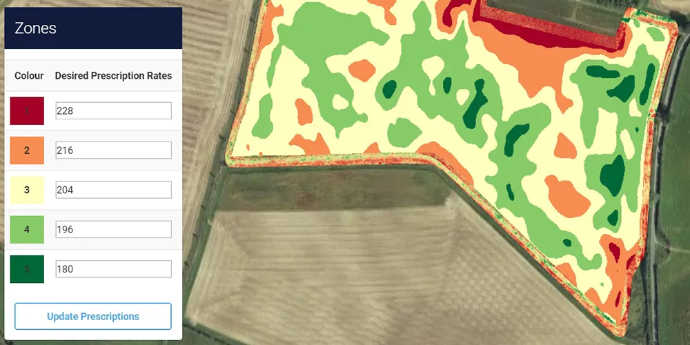
This tab introduces yield and nitrogen-rate data from a field managed by a farmer. The image on screen shows the nitrogen prescription component. There are no numerical axes. Spatial position on the image corresponds to location within the irregularly shaped field, which is laid over an aerial photograph.

Use the legend on the left to read the colors. The five desired prescription rates are 228 for dark red, 216 for orange, 204 for pale yellow, 196 for light green, and 180 for dark green. The units are not printed in this particular legend, so the essential point here is the ordering of higher and lower prescribed nitrogen rates. On the field, the colors form spatially coherent management zones with smooth, irregular boundaries. Nearby areas often receive the same rate. The pattern is not a plot-by-plot random scatter.

That spatial organization tells you that the nitrogen values were decisions. The farmer or a prescription system divided the field into zones and assigned rates using information thought to be agronomically relevant. The slide says the data set contains both yield and nitrogen rate, but this particular image displays the prescription-rate map, not a yield surface. To estimate nitrogen’s effect, a researcher would relate observed yield to those rates across locations.

The causal concern is already visible. If the high-rate zones differ systematically from the low-rate zones in soil, drainage, terrain, or past performance, then comparing their yields changes more than nitrogen. Flip to the Farmer’s decision tab and ask what information produced these colored zones.

Yield and nitrogen rate data obtained from a field that is managed by a farmer
Transcript

Start with the Farmer bullet. The farmer decides the nitrogen rate using soil and field characteristics, perhaps soil quality, drainage, terrain, or how each area performed in previous years. That is sensible farm management. The farmer is trying to place inputs where they are most useful, not create clean data for us. Assignment is therefore purposeful rather than random.

Now move to the Researcher bullet. Suppose some of those characteristics are not available in the research data. We observe nitrogen and yield but do not receive a complete soil map. Any omitted soil characteristic that affects yield belongs in the econometric error term. The fact that the farmer observed it does not help the researcher unless it is recorded and included.

Read the equation aloud: yield equals beta zero, plus beta one times N, plus the quantity gamma times S-C plus v. Yield is the crop outcome. Beta zero is the intercept. N is the nitrogen rate. Beta one is the causal nitrogen effect we want to estimate, expressed as the change in yield for one additional unit of nitrogen if other determinants are held fixed. S-C denotes soil characteristics. Gamma describes their effect on yield. V collects the remaining unobserved determinants. The parentheses make clear that gamma times S-C plus v is the composite error in a regression that includes N but omits soil characteristics.

The last bullet supplies the endogeneity link: N and S-C are correlated because the farmer used S-C when selecting N. Since S-C is inside the error and affects yield, N is correlated with the error. A high-N versus low-N comparison is also a comparison of different soil conditions. This has exactly the firefighter structure. Deployment responded to fire scale; nitrogen responds to soil information. Once you learn to see the decision rule that chose the explanatory variable, you see potential endogeneity everywhere. The next tab uses a particular decision rule to determine the direction of the bias.

Farmer

  • decide nitrogen rate based on soil/field characteristics (some of them we researchers do not get to observe)

Researcher

  • soil characteristics are not observable, so they are in the error term

yield = \beta_0 + \beta_1 N + (\gamma SC + v)

  • N (nitrogen rate) and SC (soil characteristics) are correlated
Transcript

Let’s make the omitted-variable problem concrete and get the direction right, because the sign comes from the farmer’s behavior. The slide asks you to suppose that the farmer applies more nitrogen to areas whose soil characteristics would lead to higher corn yield even without that extra nitrogen. In the previous notation, nitrogen and favorable soil characteristics are positively related, and favorable soil characteristics have a positive effect on yield.

Now answer the question on the screen. If the researcher estimates a model that includes nitrogen but ignores soil characteristics, the high-nitrogen observations tend to have higher yield for two reasons. They receive more nitrogen, and they are located on better soil. The regression has no soil variable to receive credit for the second reason, so it assigns both patterns to nitrogen. Under the stated assumptions, the estimated nitrogen slope is biased upward. We overestimate the impact of nitrogen on corn yield.

You can see the sign in the standard omitted-variable logic: the direction of bias depends on the sign of the relationship between nitrogen and soil quality multiplied by the sign of soil quality’s effect on yield. Positive times positive gives positive bias. If the farmer instead applied more nitrogen to poor ground to compensate, nitrogen and favorable soil quality would be negatively related. With a positive soil effect, the bias would be negative, and we would underestimate nitrogen’s effect. Other combinations lead to other signs.

This bias is not ordinary noise that automatically averages away when you collect more observations from the same decision process. A larger sample can estimate the confounded association more precisely while remaining systematically wrong for the causal effect. To break the link, we need either adequate soil controls or a source of nitrogen variation unrelated to soil. The next tab shows the clean design-stage solution: randomized nitrogen assignment.

Suppose the farmer applied more nitrogen to the area where its soil characteristics lead to higher corn yield

Question If the researcher estimate the model (which ignores soil characteristics), do you over- or under-estimate the impact of nitrogen rate on corn yield?

Transcript

Now look at the randomized field experiment. The rectangular grid represents experimental plots, so horizontal and vertical position indicate where each plot sits in the field. There are no numeric x and y axes. Each colored rectangle is one plot’s assigned nitrogen rate. Read the legend at the bottom: red is 111 pounds per acre, orange is 134, pale yellow is 156, light green is 178, and blue is 201. Those five treatment levels appear repeatedly throughout the grid.

Compare the pattern with the farmer’s prescription map. Here, red, orange, yellow, green, and blue plots are interspersed. High rates sit beside low rates, and the colors do not form smooth management zones that follow an underlying field feature. A researcher assigned the nitrogen rates at random rather than choosing them from soil information. The scattered pattern is visual evidence of that assignment process, although in a real study we would verify the randomization protocol rather than judge it only from a map.

Now read the callout. Soil quality is still unobserved and still belongs in the error term because it affects yield. We have not measured it, removed it, or made it unimportant. What has changed is its relationship with N. A random number generator does not know which plots have good soil, so across repeated assignments it gives each nitrogen level the same distribution of soil quality. Nitrogen is therefore no longer systematically correlated with the soil component of the error.
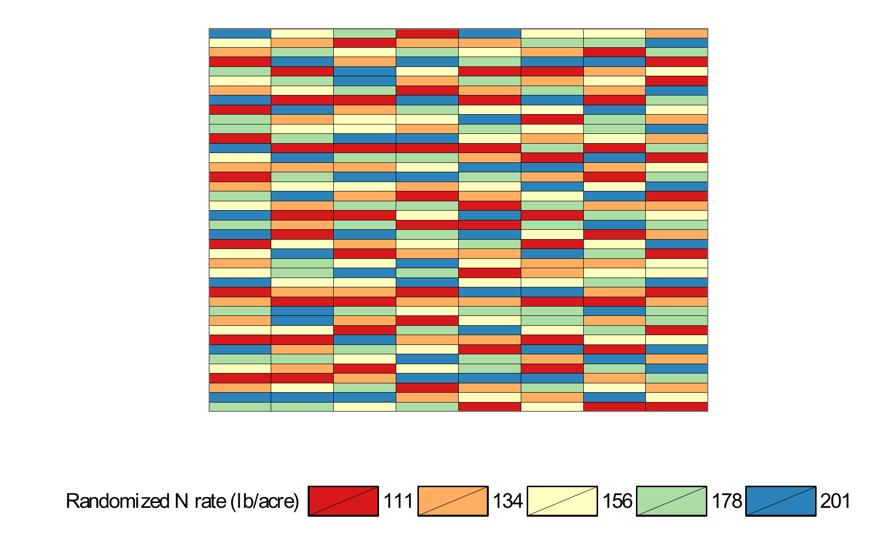
Any one finite grid can have chance imbalance, which is why the previous slide said “on average.” But unlike the farmer’s assignment, there is no purposeful tendency to put one rate on one soil type. Comparing average yield across these randomized rate groups can isolate nitrogen’s causal effect, with uncertainty reflecting finite-sample variation. This is the design-stage cure. The next tab asks why we cannot simply randomize the main variables in every economic question.

Important

Soil quality (in error term) is no longer correlated with N!!

Transcript

So why not use the randomized-field solution everywhere? Start with the first question. Could researchers randomly determine how much education each person is allowed to receive? In most settings that would be ethically unacceptable, legally constrained, and practically impossible. Education unfolds over years, people can refuse an assignment, and researchers cannot reasonably force one group to leave school early simply to create a comparison. We may sometimes randomize an educational program, scholarship offer, or information treatment, but not the entire lifetime amount of schooling in the simple way imagined here.

The second block explains why this problem is especially common in economics. Economics studies human behavior, and people make decisions using available information in an effort to reach good outcomes. The blue qualification matters: whether the decision ultimately succeeds is irrelevant. Endogeneity can arise because the choice responds to information, even if the chooser makes a mistake.

Work through the three indented examples. A person chooses how much education to obtain partly from a judgment of their own ability, costs, and expected returns, not by rolling a die. A dispatcher chooses how many firefighters to send using information about the scale of the fire, not by rolling a die. A farmer chooses how much nitrogen to apply using soil and field characteristics, not by rolling a die. In every case, the decision variable becomes associated with information that can also affect the outcome. If some of that information is missing from our data, the decision is correlated with the error term.

The final bullet uses “smart” informally to mean purposeful and information-responsive, not necessarily correct or intellectually superior. If economically important choices really were assigned by dice, identifying many causal effects would be much easier because the choices would already contain exogenous variation. Usually they are not. That is why the rest of the course focuses on assumptions and methods that recover useful comparisons from nonrandom decisions.

Randomized Experiment?

Researchers determine randomly how much education subjects (people) can get?

Endogeneity Problem in Economics

  • Economics is about understanding human behavior

  • Almost always, you need to deal with endogeneity problem because people are smart: we make decisions based on available information (not just randomly) so that our decisions lead to good outcomes (whether our decisions turn out to be good or not is irrelevant)

    • how much education one gets is determined based on their judgment of their own ability (not by rolling a dice)
    • how many fire fighters to be deployed was determined based on the scale of fire (not by rolling a dice)
    • how much nitrogen to apply based on soil characteristics (not by rolling a dice)
  • If people are not smart and just roll a dice for their decision making, we would have much easier time identifying causal effects

Road map of this course


Road map of this course

Transcript

Let me leave you with the shape of the semester, so every lecture from here has an address. The sentence at the top gives the organizing principle. Almost everything we do is either understanding what an estimate needs in order to have a causal interpretation, or dealing with endogeneity when those requirements do not hold automatically.

Lectures one through three explain ordinary least squares. You will see how O-L-S constructs a fitted line or plane, how to interpret its coefficients, and what assumptions are needed for those coefficients to recover causal effects rather than conditional associations. Lecture four studies omitted-variable bias directly. We will derive what goes wrong when a confounder is left out and use the relationships among the omitted variable, the included regressor, and the outcome to determine the direction of bias.

Lectures five through eight build the inferential and modeling tools around regression: hypothesis tests, standard errors, modeling choices, and large-sample properties. Those topics tell you how estimates vary across samples, how to quantify uncertainty, how specification changes interpretation, and what approximations become valid as the sample grows. They do not by themselves cure endogeneity, but they are necessary for using and evaluating the later methods.

Lecture nine returns to endogeneity and defines it formally as a relationship between a regressor and the error term. Then lectures ten through twelve give us three major strategies. Panel-data methods use repeated observations on the same unit to remove certain unobserved factors that do not change over time. Instrumental variables find variation in x that is related to x but unrelated to the outcome error, allowing us to isolate a cleaner source of movement. Difference-in-differences uses outcome changes in a comparison group to estimate the counterfactual change the treated group would have experienced without treatment, mimicking part of an experiment under a parallel-trends assumption.

Now read the final callout, because it is the honest summary of the course. Keep the firefighter example in mind. The raw data compared large, severe fires with small, mild fires and confused severity with deployment. Every method above offers a different answer to the same question: how can I compare fire events that are effectively of the same scale when I never get to observe scale directly? If you can keep identifying the desired comparison, the source of the unwanted comparison, and the assumption that closes the gap, the individual techniques will fit together as one coherent course rather than a list of formulas.

Almost everything we do from here on is either (a) understanding what it takes for our estimates to be causal, or (b) dealing with endogeneity when it is not.

  • 01-03: how OLS works, and what has to be true for OLS to recover a causal effect
  • 04: what exactly goes wrong when a confounder is left out (omitted variable bias)
  • 05-08: hypothesis testing, standard errors, modeling choices, and large-sample properties
  • 09: endogeneity, defined formally
  • 10 (panel data): use repeated observations on the same unit to get rid of unobservables
  • 11 (instrumental variable): find variation in x that is unrelated to the error term
  • 12 (difference-in-differences): use a comparison group to mimic an experiment

Important

Keep the firefighter example in mind. Every method above is just a different answer to the same question: how do I compare fire events that are of the same scale, when I never get to see the scale?